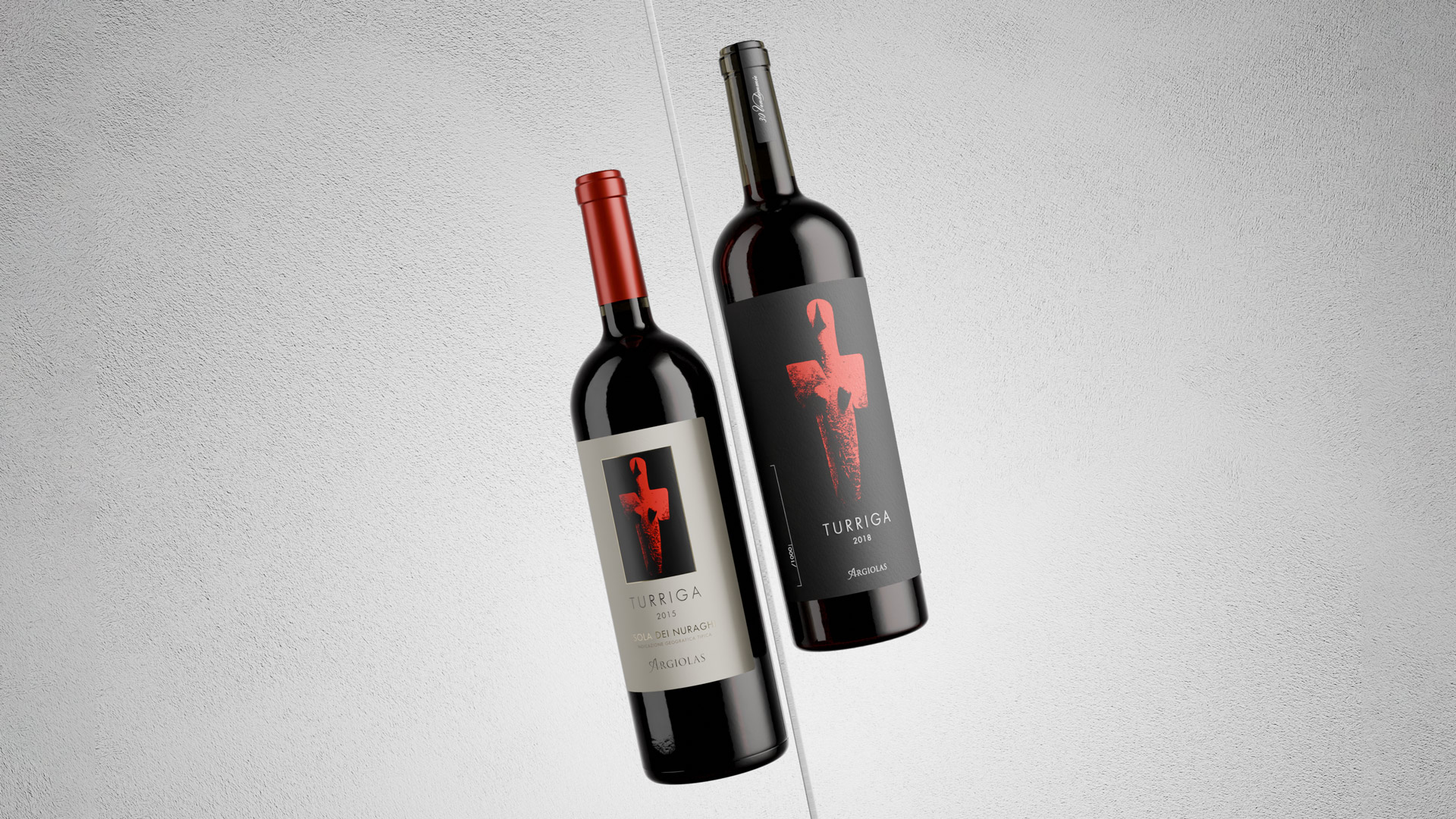
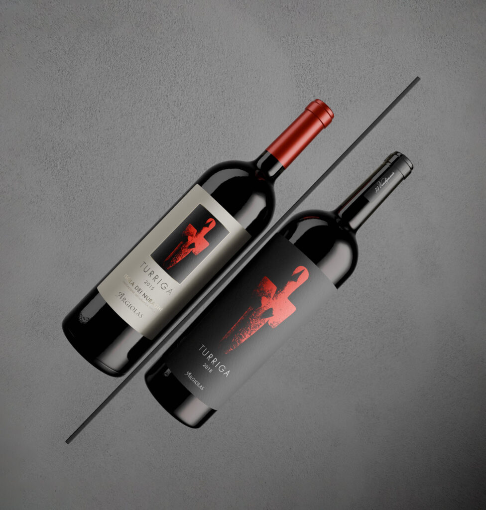
Turriga is the flagship wine of Argiolas and one of the most iconic names in Sardinian winemaking. A multi-award-winning label that, for over thirty years, has embodied a strong sense of place and the vision of a family.
When Argiolas entrusted us with the packaging restyling, we knew we were handling an icon — a piece of history. That’s why we chose to approach the project with respect and sensitivity. While preserving the original spirit of the label, we reimagined it with a more contemporary visual language, aligned with the stylistic evolution of the entire product range.
Why — and how — do you renew a design that already works?
In the world of wine, the label is much more than just packaging: it’s the first point of contact with the consumer, the product’s first visual story, and one of the key elements shaping its perception. But when a label has an established image, one deeply ingrained in collective memory, how can you step in without altering its essence or losing the hard-earned recognizability built over the years?
In this case, the change couldn’t be radical. It had to be a careful, harmonious transformation — one that enhances what already existed, making it more legible, more refined, and more aligned with its premium positioning. We worked on the details, the composition, the typography — aiming to strengthen its recognizability and refresh its perception, without ever losing the bond with its history.
A new visual harmony
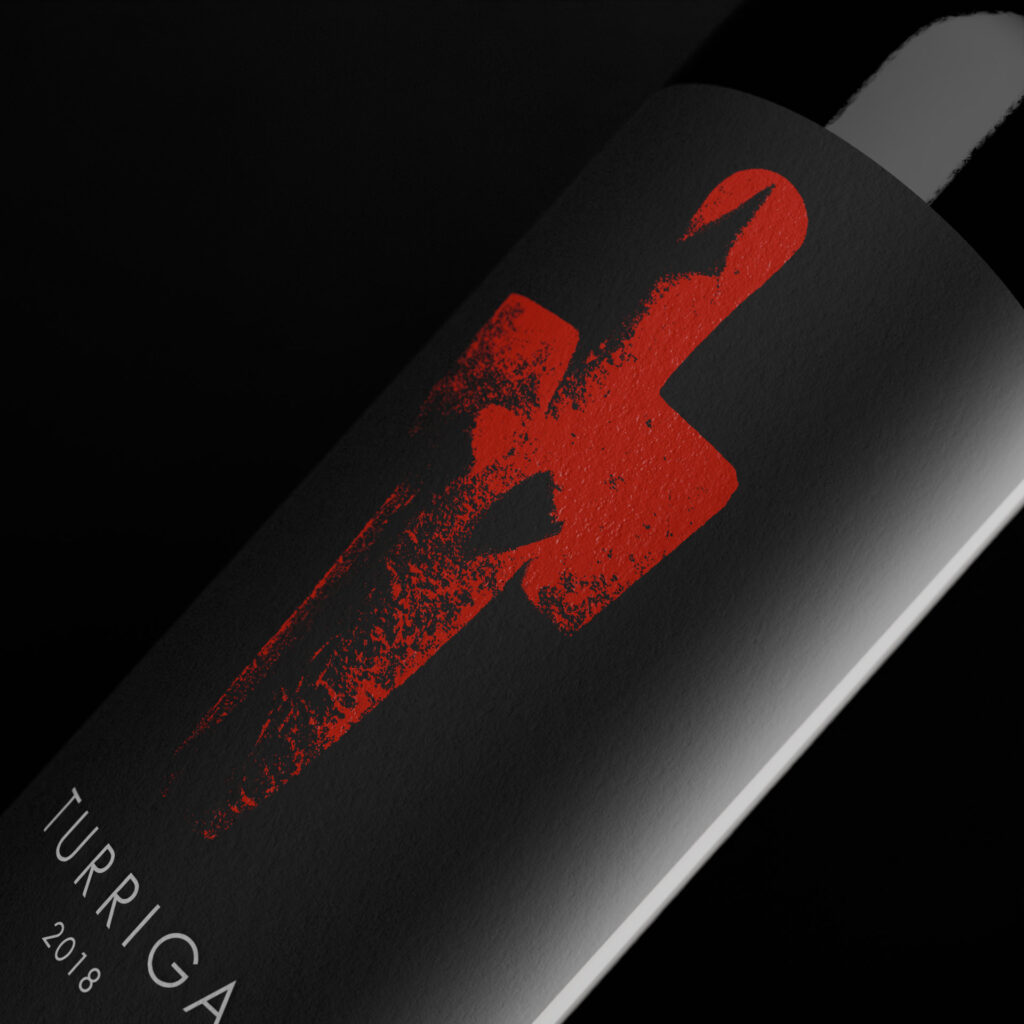
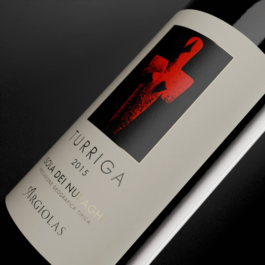
The name “Turriga” traces back to a very distant past. It comes from a marble statuette of the Mother Goddess, over five thousand years old, found in the area of Turriga, between Senorbì and Selegas — land that today is home to some of Argiolas’ estates.
This female figure, now kept at the Archaeological Museum of Cagliari and featured in an illustration on the label, embodies nature’s generative power — a symbol of the fertile earth that gives life, nurtures the vine, and produces the wine.
A project born from in-depth analysis
Before approaching the design, we carried out an in-depth strategic and marketing analysis. This allowed us to fully grasp Argiolas’ positioning among its competitors and the pivotal role this wine holds within the product range.
The Turriga label restyling is part of a broader project that also encompassed other products in the range, with the goal of reinforcing and renewing a coherent, distinctive visual identity for the entire brand.
Our approach: a new visual harmony
Graphic clarity and a simplified layout to give key elements room to breathe, with careful management of spacing.
Establishing a visual order and hierarchy that keeps the illustration at the center, followed by the wine’s name — a choice that reinforces the uniqueness of this product within the range.
Refinement of the illustration depicting the Mother Goddess, enhancing its chiaroscuro details and strengthening the evocative power of the original artwork.
Use of the brand’s official font, also applied to other labels in the range, to create a strong family feeling — aligning the style while preserving recognizability.
Looking to refresh your packaging without losing its identity?
At NSG, we understand how delicate it is to work on products with a history. And we also know how to do it without compromising it.