Packaging restyling for Mamete Prevostini; consistency and positioning across a structured product range
A historic winery, with packaging designed to evolve alongside it
In the wine industry, even brands with a long history and a strong, well-established identity—such as Valtellina winery Mamete Prevostini—must respond to changing consumer expectations, new markets and constantly evolving visual languages.
In this context, a conservative packaging restyling becomes a strategic choice: not to rewrite the brand’s story, but to refresh its image and provide it with new tools to continue telling that story effectively.
How can a multi-tiered product range be redesigned while preserving recognition, consistency and a clear identity for each individual line?
In packaging design, details often have a significant impact on the perceived value of a product.
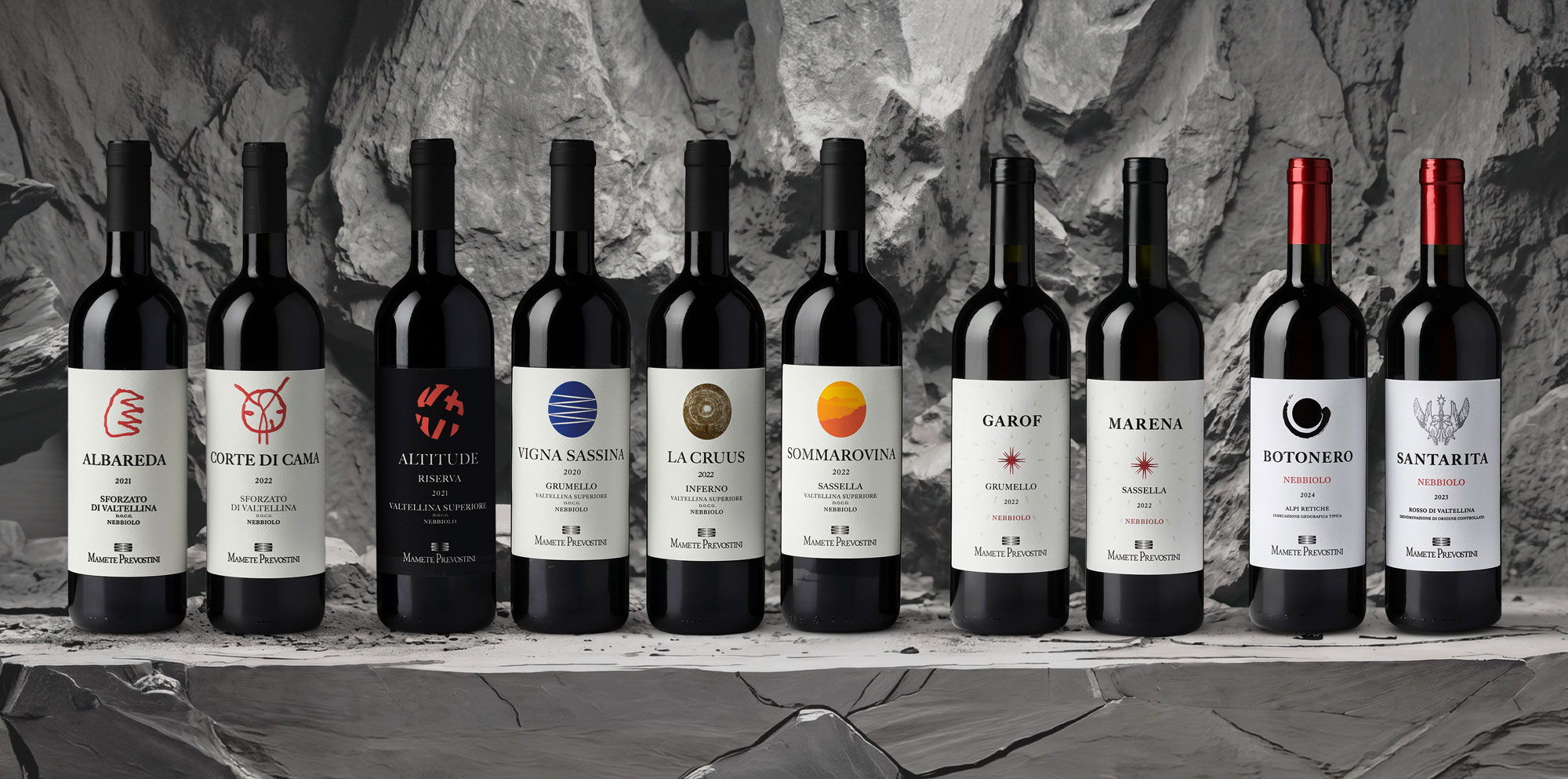
For this reason, we adopted a measured approach to the restyling: simplifying the layout, clarifying the information hierarchy to improve readability and the overall label design, and creating both continuity and differentiation across the various products through shared graphic elements and carefully selected materials.
Linea Giovani: simplicity and immediacy
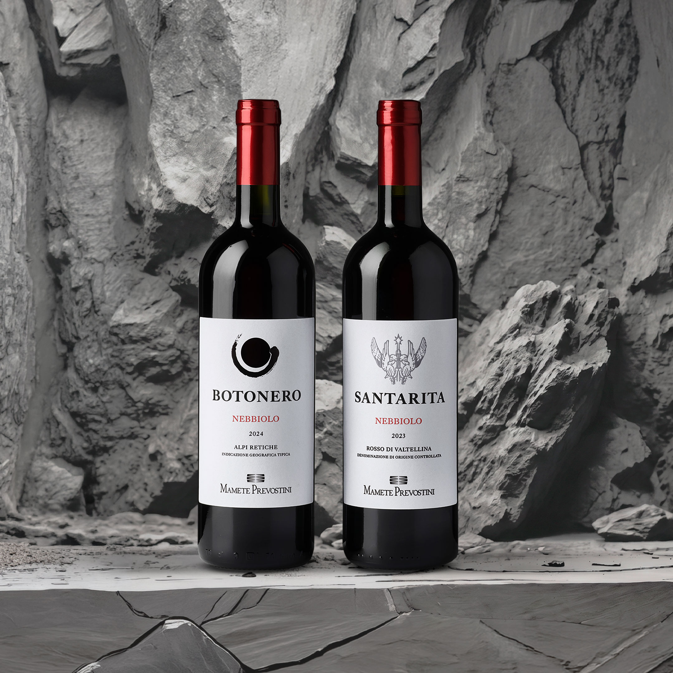
The entry-level range is often the consumer’s first point of contact with the brand. Here, the design becomes essential, direct and immediate.
The labels feature a clean visual structure, with a distinctive element and the product name positioned at the top to ensure instant readability.
On Botonero, the distinctive detail takes the form of a die-cut hole in the paper.
On Santa Rita, it becomes an embossed graphic element.
The natural white paper, with its subtle texture, reinforces the positioning of the line: accessible, fresh and contemporary.
The result is clear, recognisablewine packaging designed to make products easier to identify and select on the shelf.
"Classici" Line; balance and identity
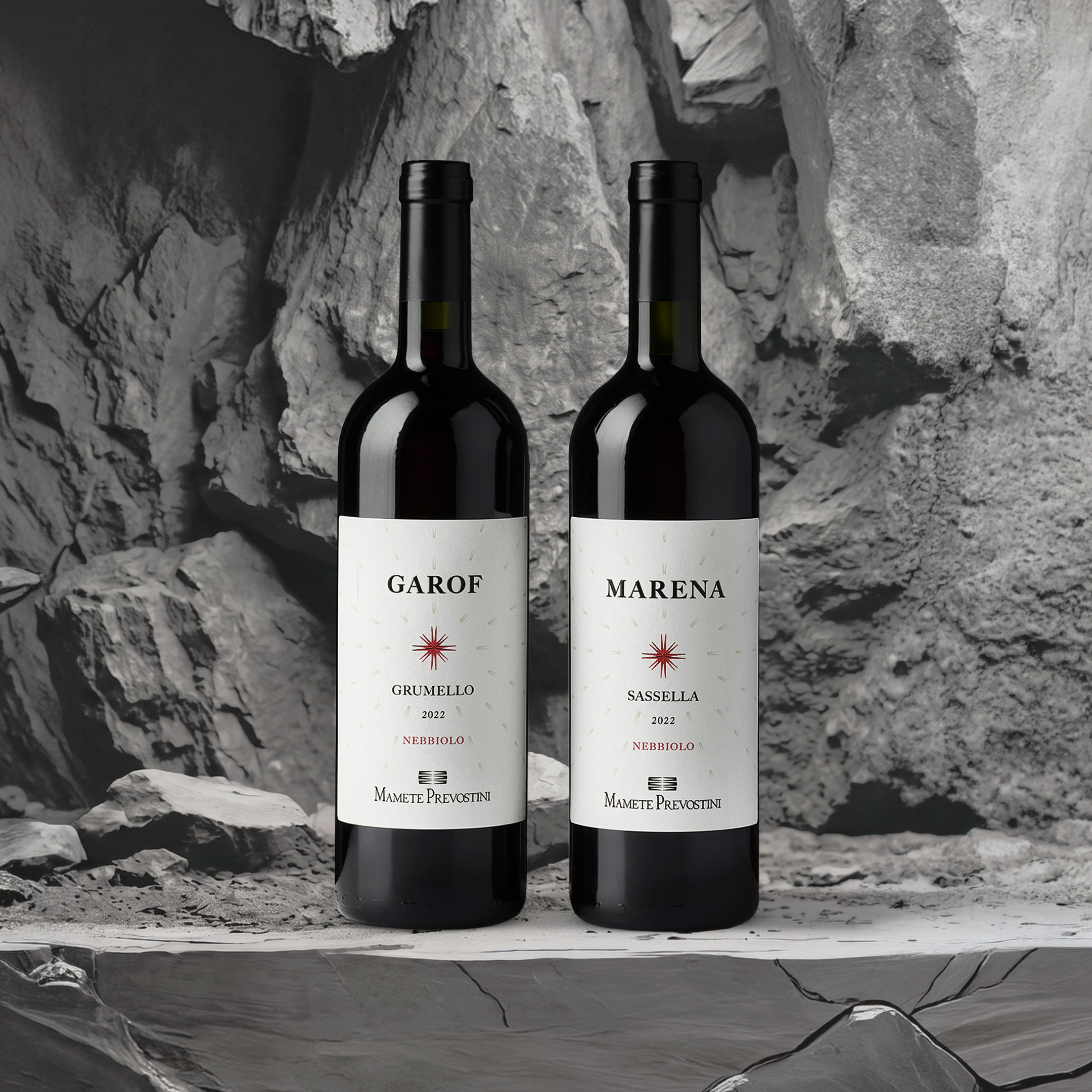
In the Classici range, the visual language evolves towards greater structure and depth.
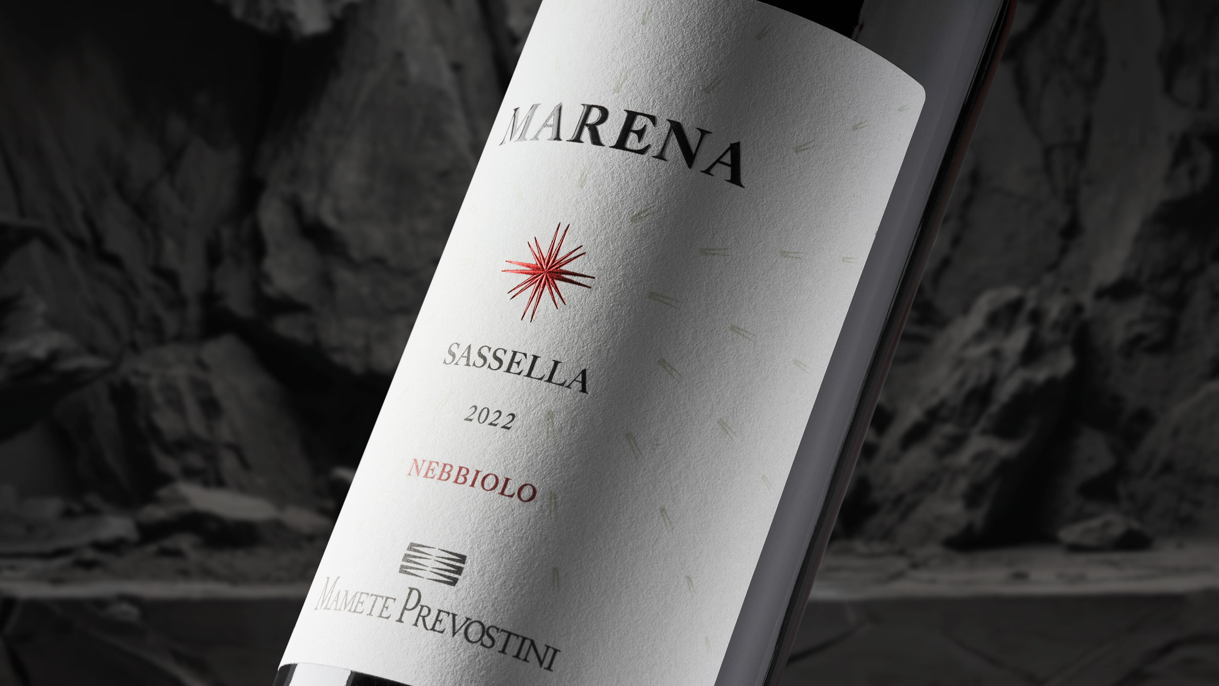
The central star becomes the key design element: a unifying visual focal point towards which all the elements of the label converge, creating order and a clear hierarchy.
The product name moves to the top, while the star is enhanced through red foil and three-dimensional embossing.
The more tactile ivory paper introduces a higher level of perceived quality compared with the entry-level range, helping to elevate the overall positioning of the product.
Cru and Riserva Lines; expression and distinctiveness
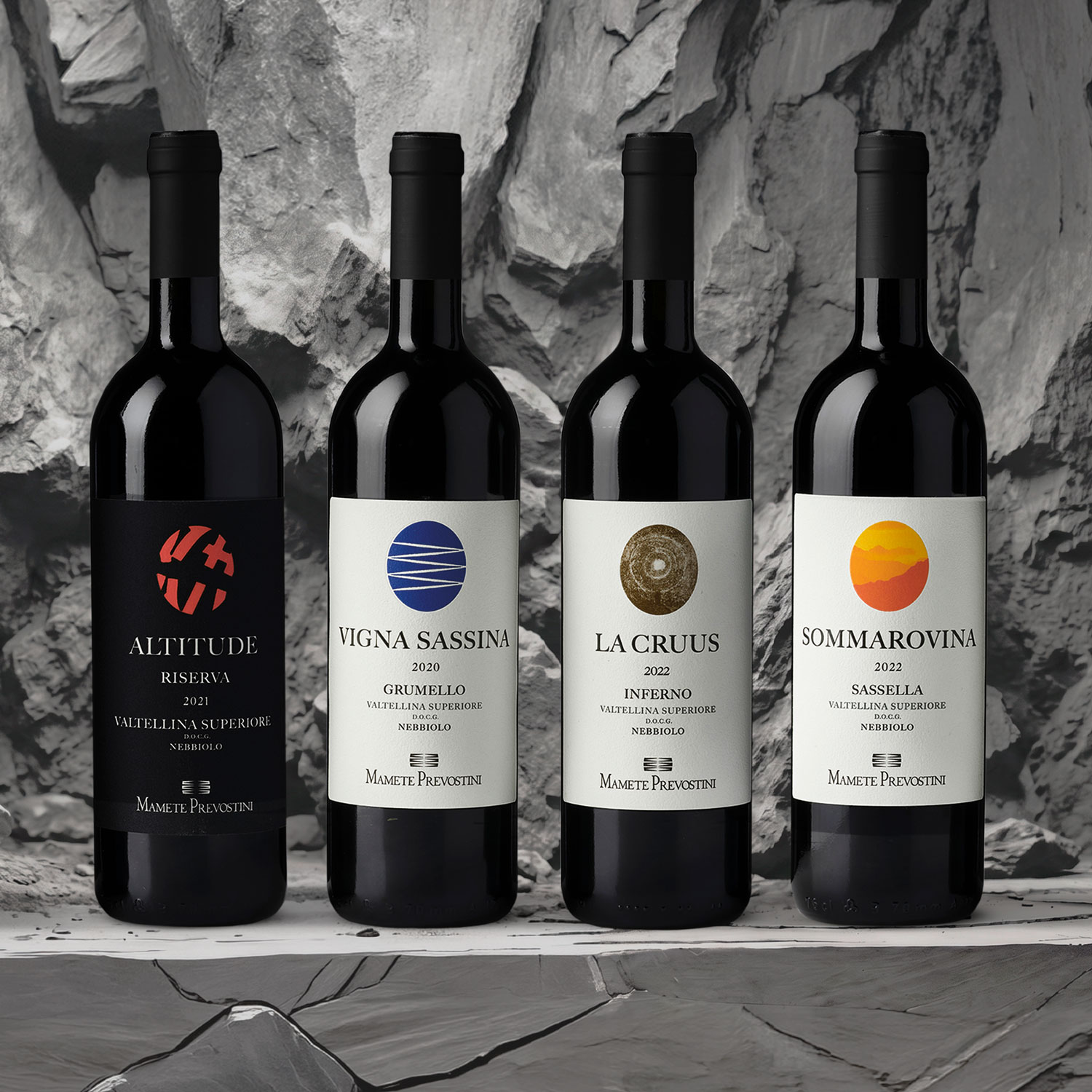
At the premium end of the range, the design becomes even more expressive and distinctive.
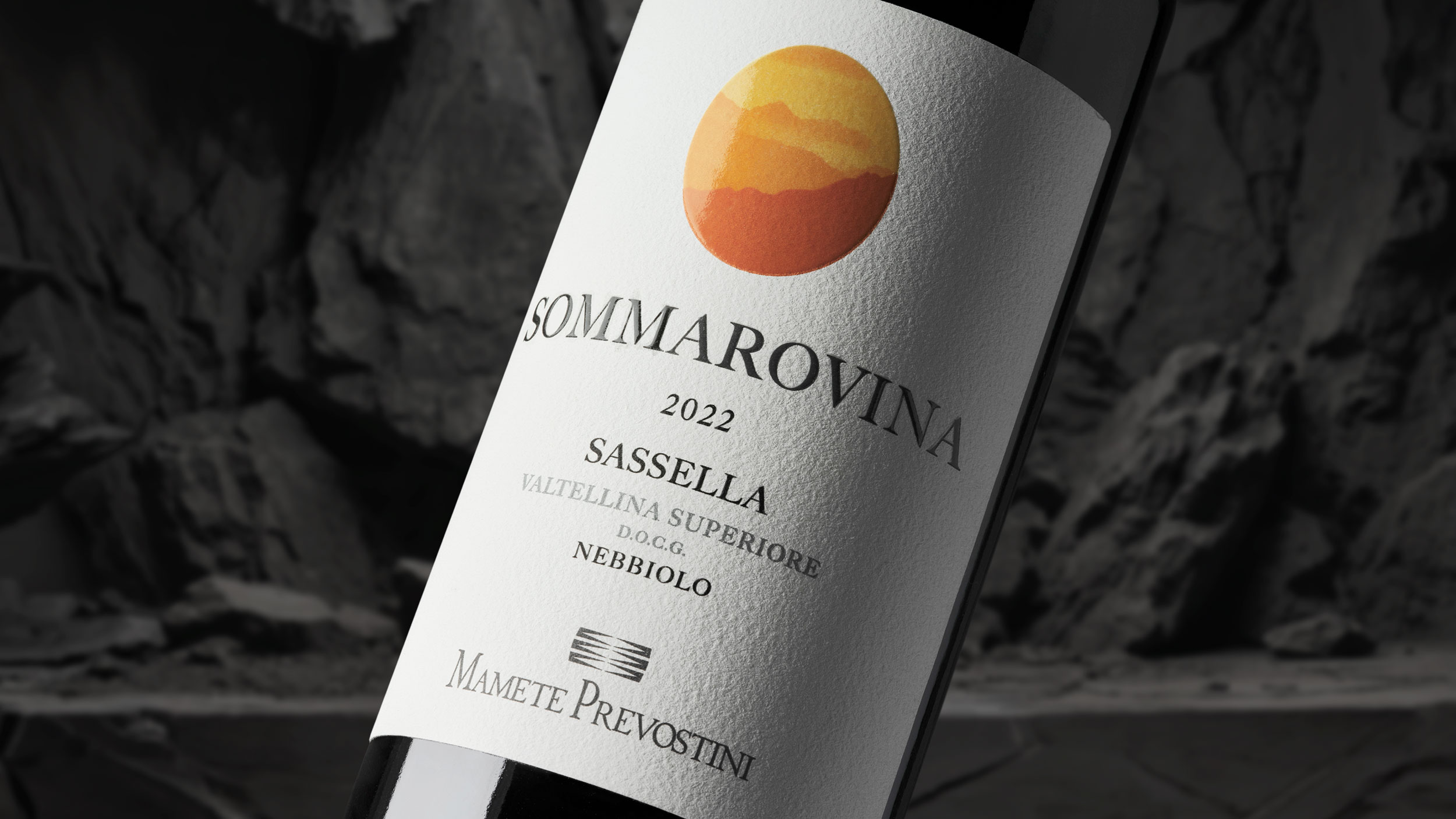
The defining element is the oval shape, which characterises the entire line while evolving from one product to the next. Illustrations and colours vary to differentiate each label, while selected references are further enhanced with glossy finishing details.
For the most prestigious wine, the Riserva, the evolution is even more striking: the label becomes black, while the oval is only subtly suggested, making way for a vivid red embossed graphic mark.
The heavier, more tactile ivory paper amplifies the premium perception and creates a clear distinction between this range and the others.
Sforzati Line: Ancestral Symbols and Identity
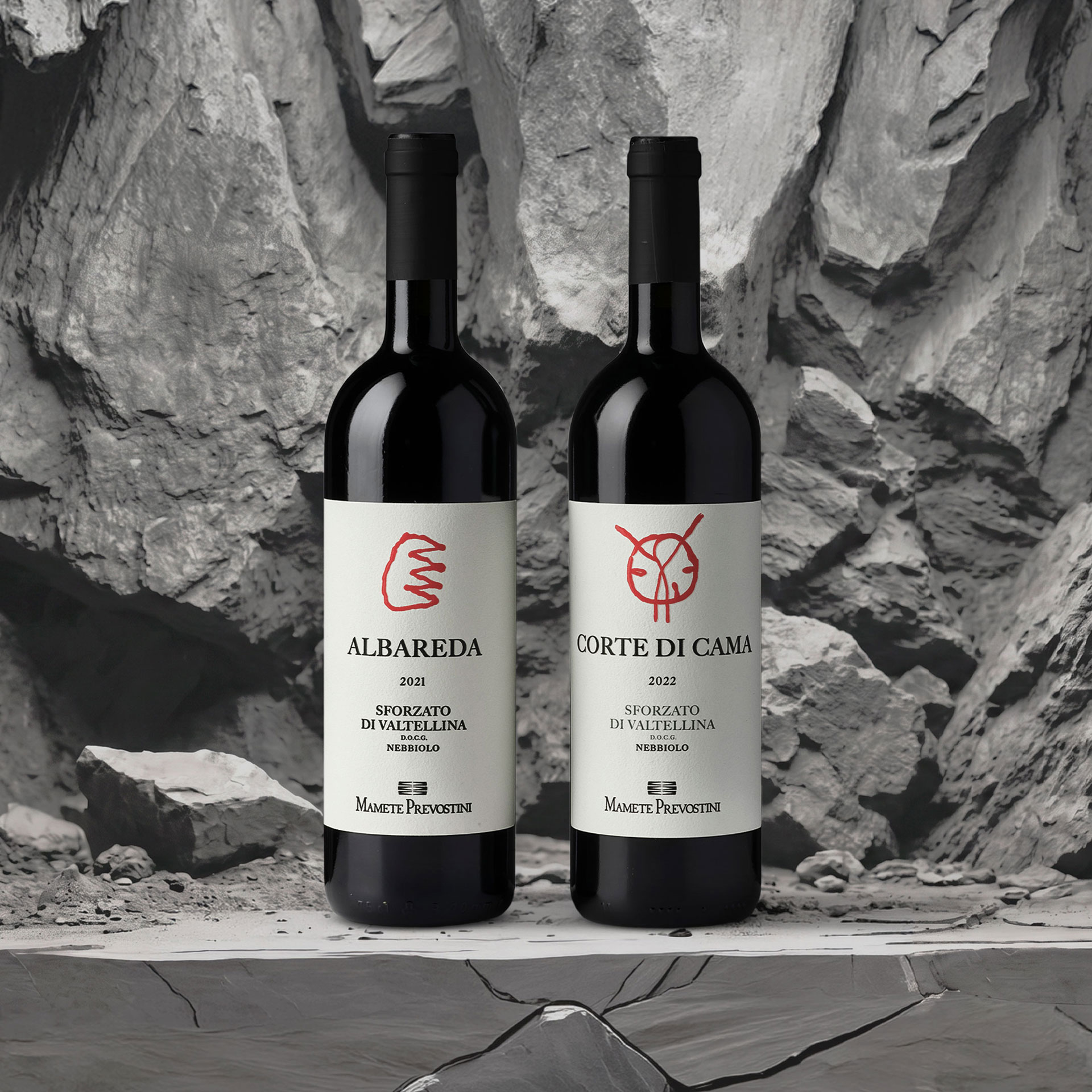
For Corte di Cama and Albareda, the ancestral symbols were taken out of the geometric shapes that previously enclosed them, giving each mark greater visual strength and a more distinctive identity.
Corte di Cama evokes the ancient courtyard and the passage of people.
Albareda conveys the concept of strength.
Both symbols are enhanced through embossing and printed on the same textured paper used for the Cru and Riserva wines, ensuring continuity with the line’s premium positioning.
A more organised, consistent and distinctive range
Overall, the restyling project resulted in packaging designed to:
Strengthen visual consistency across the different ranges
Preserve and clarify the various positioning levels
Improve readability and shelf impact
Enhance each individual product without losing the overall brand identity
Achieving this balance is far from straightforward, particularly when designing wine labels across different price segments.
Discover how we can help you build a product range that is consistent, recognisable and distinctive.
Today, packaging can no longer be just aesthetic—it must be strategy, storytelling, and connection.
We don’t just design labels: we build communication systems that integrate design, technology, and content. Packaging that speaks, that can be touched, that can be heard. Packaging that includes—without excluding anyone.