
Branding & Brand Identity for Mirabella
- Client
- Mirabella
- Project
- Branding
- Year
- 2022
Branding Design
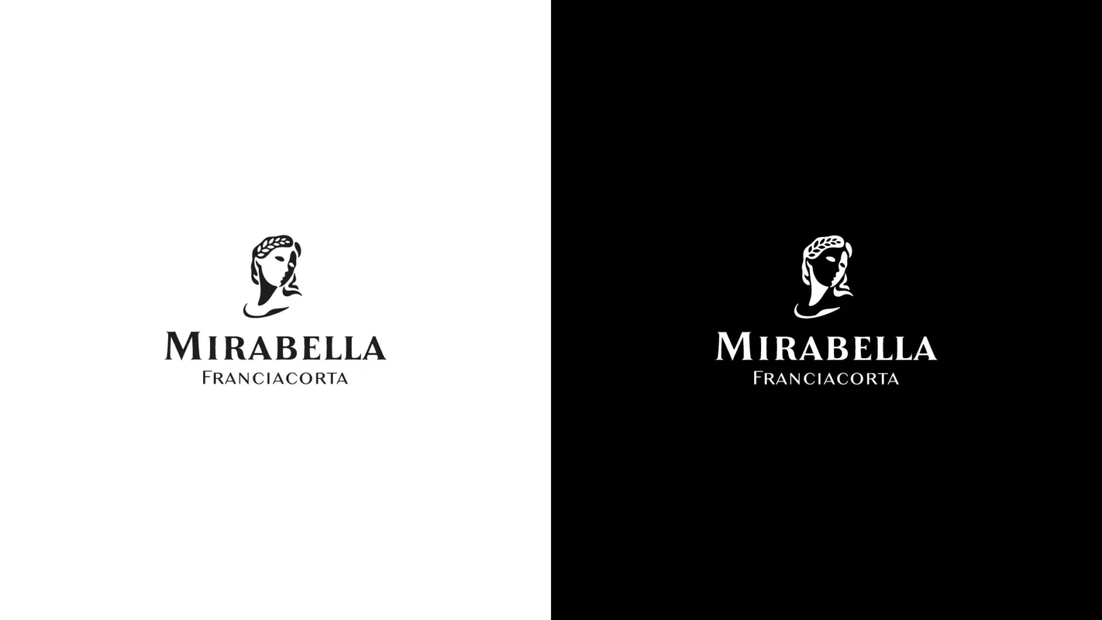
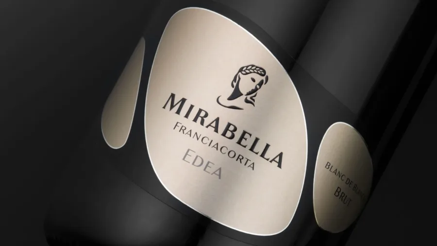
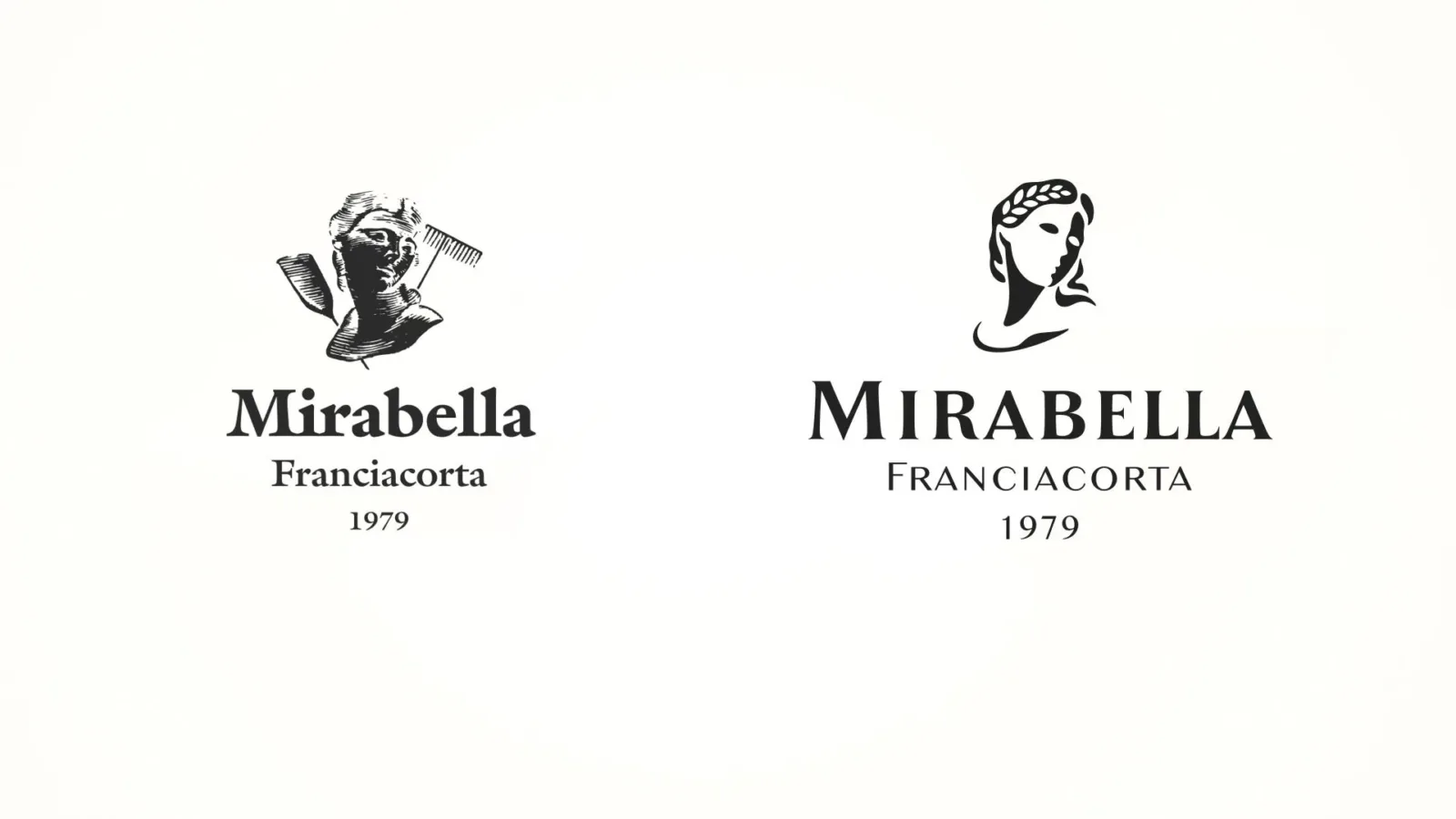
The project phase involved, first of all, the restyling of the Mirabella company symbol. The face of the goddess Demeter was redrawn, giving its reinterpretation a more contemporary character. A new, more personal symbol whose three-dimensionality is created by the positive-negative contrast of the two sides of the face and whose graphic synthesis also eliminated the reproducibility problems of the previous mark.
The brand work also involved the redesign of the company name, stylistically harmonised with the figurative symbol and with improved legibility.