
Branding & Brand Identity for Vinchio Vaglio
- Client
- Vinchio Vaglio
- Project
- Branding
- Year
- 2020
Branding Design
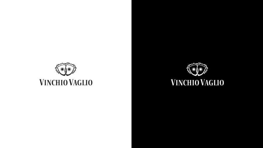
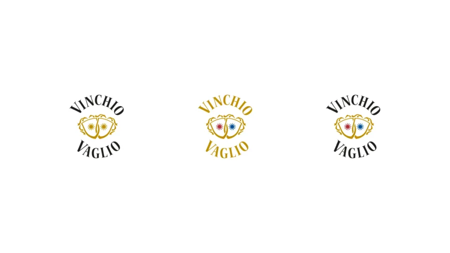
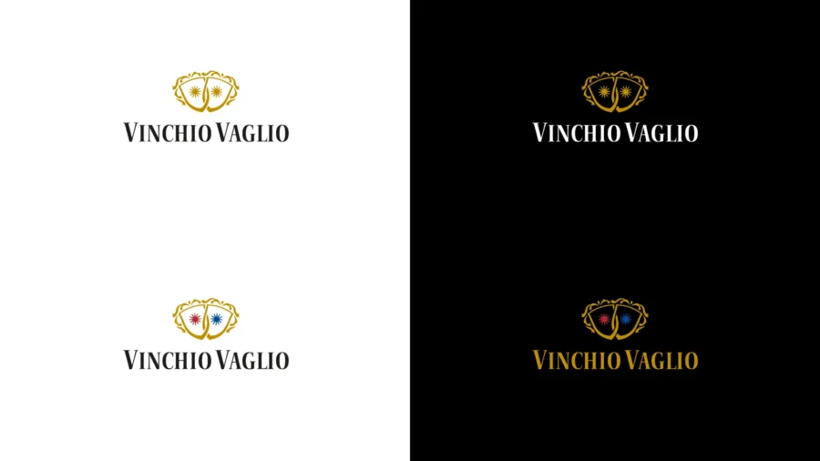
The brand image renewal started from the logo, through a conservative intervention whose goal was to preserve its recognisability for consumers.
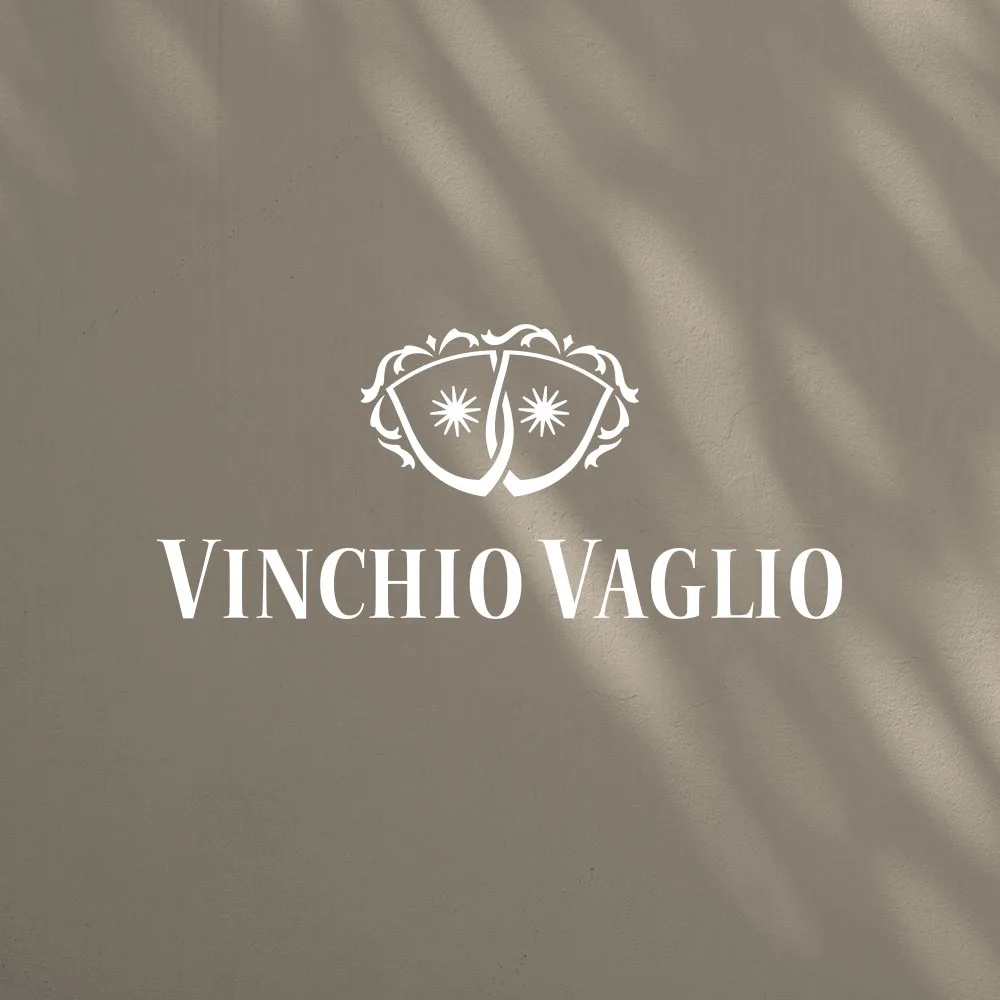
The shields, the key element to enhance, were redrawn and stylised to solve some reproducibility issues, especially at small sizes.
Moreover, the bond and synergy between the different members – one of Vinchio Vaglio’s strengths – is expressed in the new logo by the intersection of the lines that define the shields.
To improve reproducibility, the decorative elements inside and outside the shields have been simplified.
The two suns inside represent the ongoing intellectual and practical exchange between the members, which constantly enriches the company’s vision.
The company name, enhanced by specially designed lettering, has evolved into Vinchio Vaglio by dropping the word “Serra”, since in everyday use the last part of the name almost always ended up being omitted.