
Packaging design for Idda Cru Contrada Stella
- Client
- Idda
- Project
- Packaging
- Year
- 2026
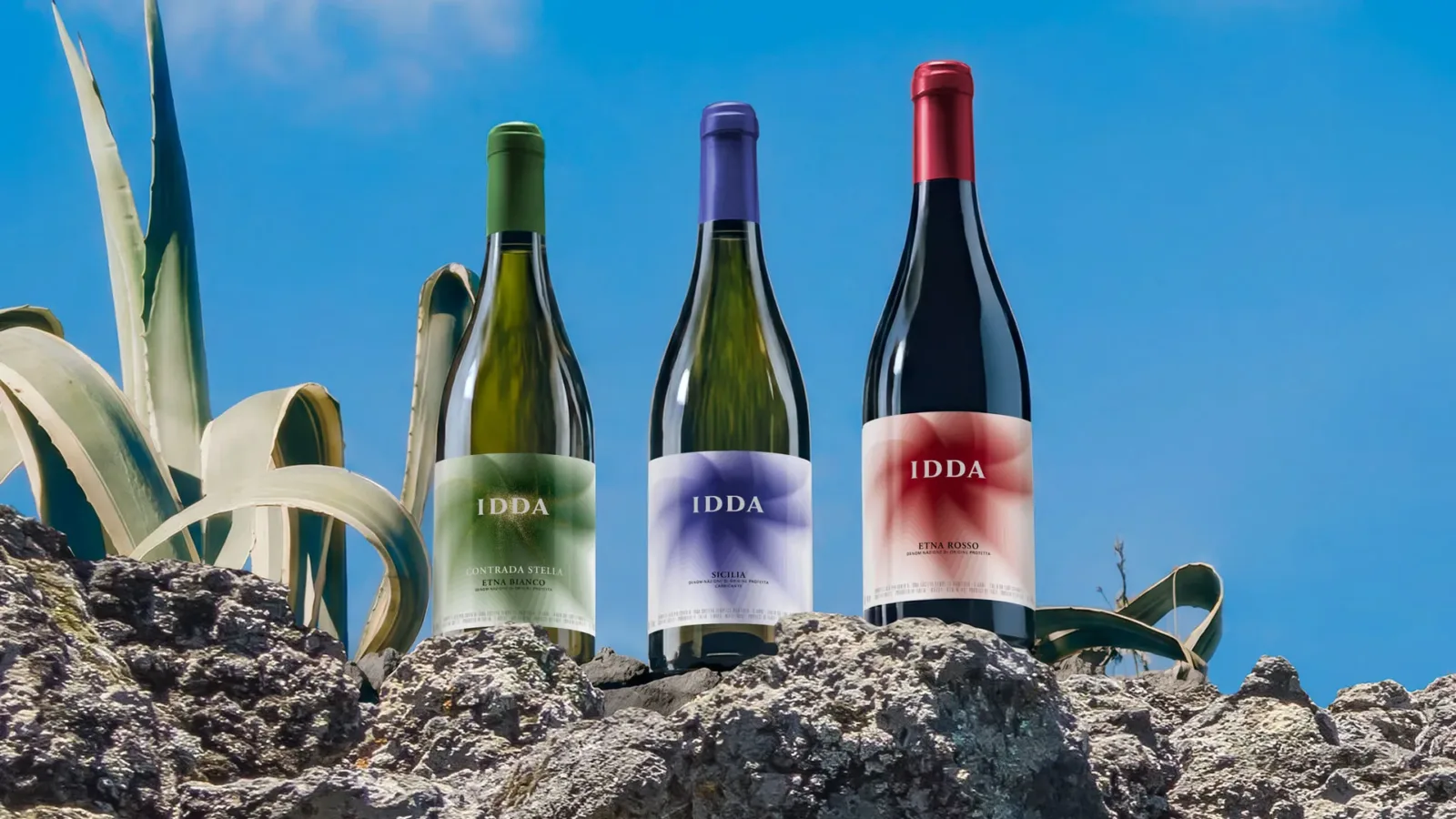
Packaging design for Idda Cru Contrada Stella, Gaja’s new interpretation of Etna

The new Cru Contrada Stella marks an evolution for Idda.
Hence the need for a wine design that introduced an element of visual distinction while remaining fully consistent with the brand’s language and the identity of the project.
Idda: a presence, an identity to interpret
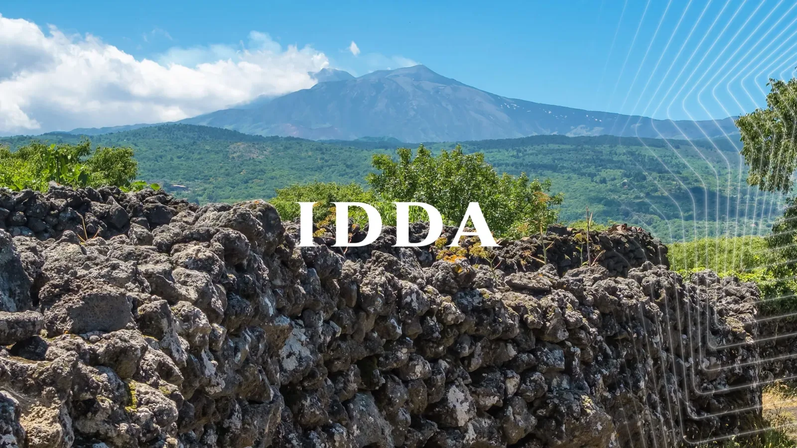
Idda was born in 2016 from the collaboration between two great wine families, Gaja and Graci, eager to explore and interpret an extraordinary terroir: the south-western slopes of Mount Etna, between 600 and 800 metres above sea level.
“Idda” means “She” in Sicilian dialect and is how local people refer to the volcano: a maternal and capricious “mountain”, ordinary and extraordinary at once.
A living presence: feminine, powerful and unpredictable.
From territory to sign: a symbolic visual story
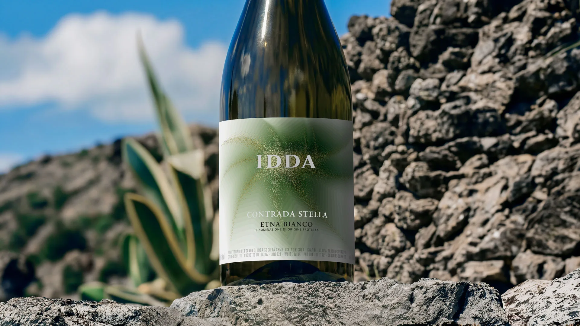
To give shape to this intense identity, an abstract, essential and contemporary representation had been chosen.
The curves of orographic maps, reworked, became parts of a dynamic graphic system that recalls the conical shape and energy of the volcano.
In the label design, colour plays a central role, as it does in Sicilian culture. The colour gradients recall the natural elements of the territory and create dynamism, with an optical effect that amplifies the perception of three-dimensionality.
A composition that guides the eye towards the summit, the crater, where the brand name sits.
The labels are printed on simple glossy coated paper, leaving room for the strength of the graphic concept.
Contrada Stella: a new cru, a new voice
Contrada Stella is a wine produced from a cru of about 1 hectare at 800 metres above sea level, in the Biancavilla area: a deep, identity-driven interpretation of Etna that deserved to be showcased both in production and visually.
The packaging had to present a perceptible variation within the system, without breaking the overall balance of the Idda project.
Colour and material as a language
We explored a stronger colour contrast with the introduction of a cast gold finish that starts from the centre of the illustration and spreads outwards, like the dust generated by a volcanic explosion.
The hand-drawn, deliberately irregular dotting adds a handcrafted, organic component, reinforcing the sense of naturalness. The result is a finish that amplifies the perception of the sign and the territory through three-dimensionality and texture.