
Mamete Prevostini packaging restyling: a coherent, well-positioned range
- Client
- Mamete Prevostini
- Project
- Packaging · Restyling
- Year
- 2026
A historic winery, packaging that has to evolve with it
In the wine world, even brands with a long history and a solid identity, like the Valtellina winery Mamete Prevostini, must keep pace with consumer expectations, new markets and ever-evolving visual languages.
In this case, a conservative packaging restyling becomes a strategic choice: not to rewrite a story, but to refresh its image and give it new tools to keep telling it.
How do you work on a system with several positioning levels while keeping every line recognisable and consistent?
In packaging design, it is often the details that shape a product’s perceived value.
That is why we opted for a measured restyling: we simplified the layout and made the information hierarchy clearer to improve legibility and the overall look of the label design, and we built continuity and differentiation across the different wines through shared graphic elements and distinct materials.
Linea Giovani: simplicity and immediacy
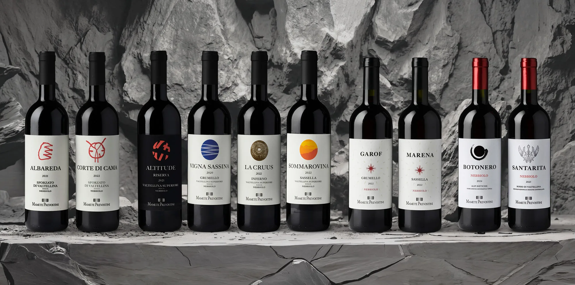
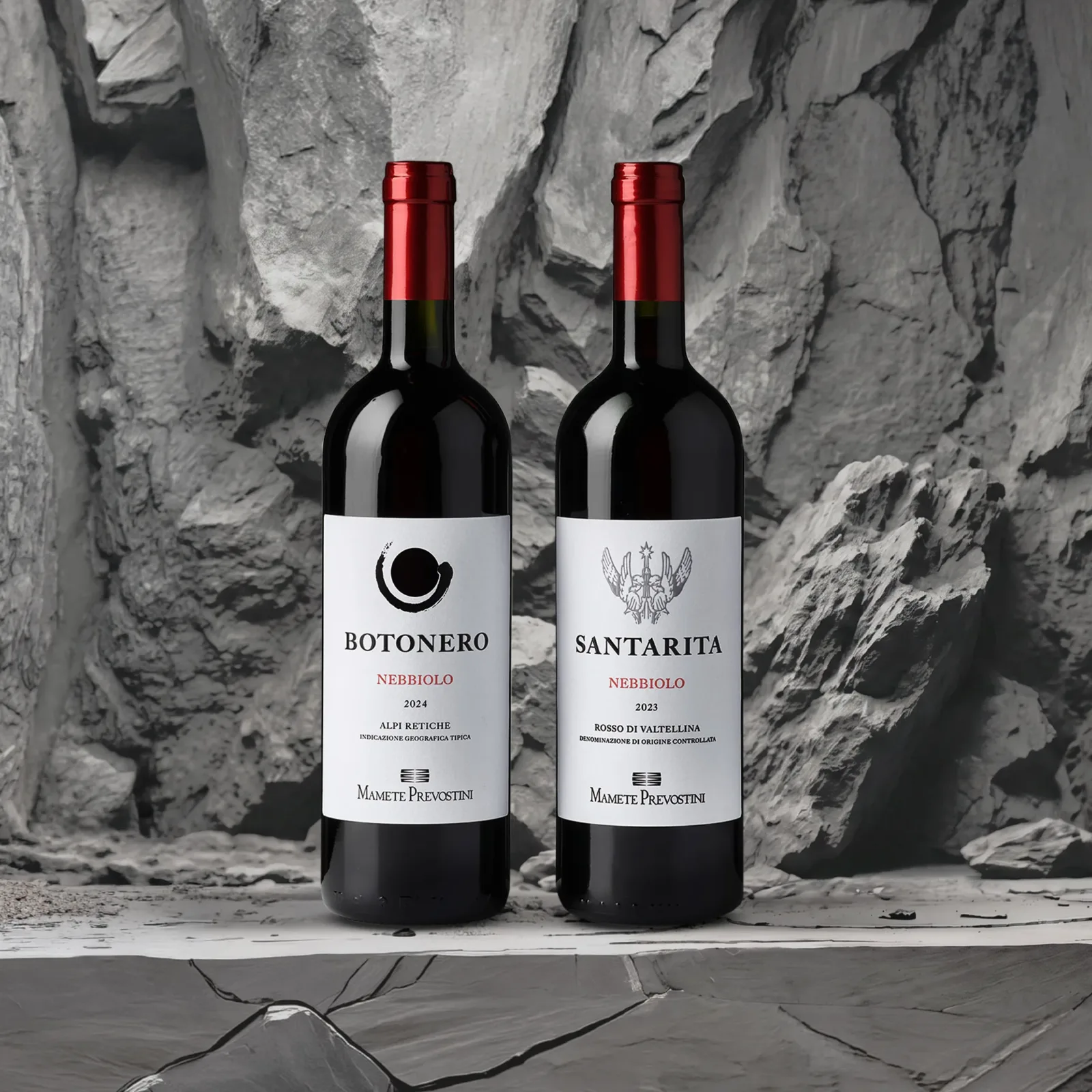
The entry-level line is the first point of contact with the brand: here the design is essential, direct and immediate.
The labels are defined by visual cleanliness, with a distinctive element and the product name placed at the top to ensure legibility at a glance.
On Botonero, the distinctive detail becomes a hole in the paper
On Santa Rita, it takes shape as an embossed subject
The natural white, lightly textured paper reinforces the line’s positioning: accessible, fresh, contemporary.
The result is a clear, recognisable wine packaging designed to make the choice easier on the shelf.
Linea Classici: balance and identity
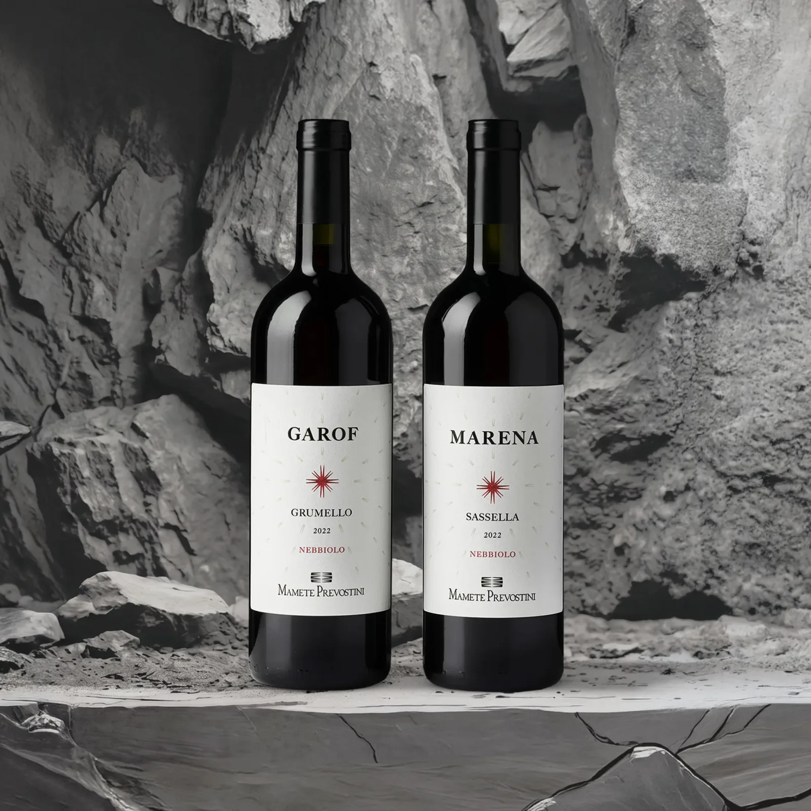
In the Classici line, the language evolves towards greater structure and depth.
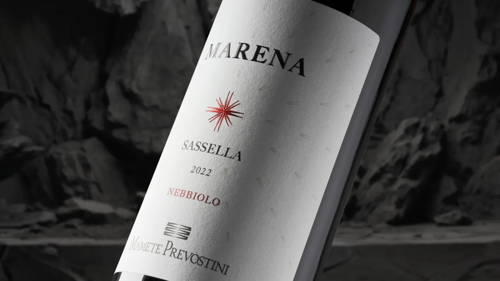
The key element becomes the central star: a unifying visual focal point where all the label’s elements converge, creating order and hierarchy.
The product name moves to the top, while the star takes shape through red foil and a three-dimensional punch.
The ivory paper, more textured than on the base line, adds a higher perceptual level and helps to elevate the perception of the product.
Linea Cru e Riserve: expression and distinctiveness
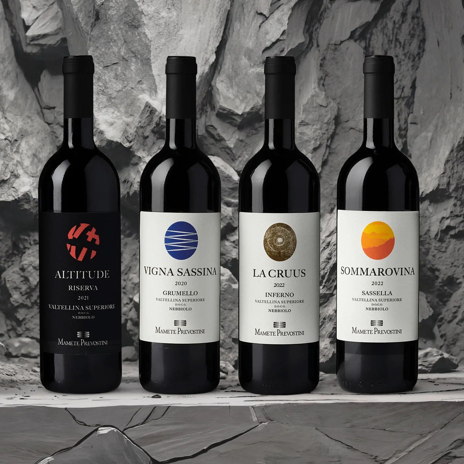
At the top of the range, the label design becomes even more expressive and identity-driven.
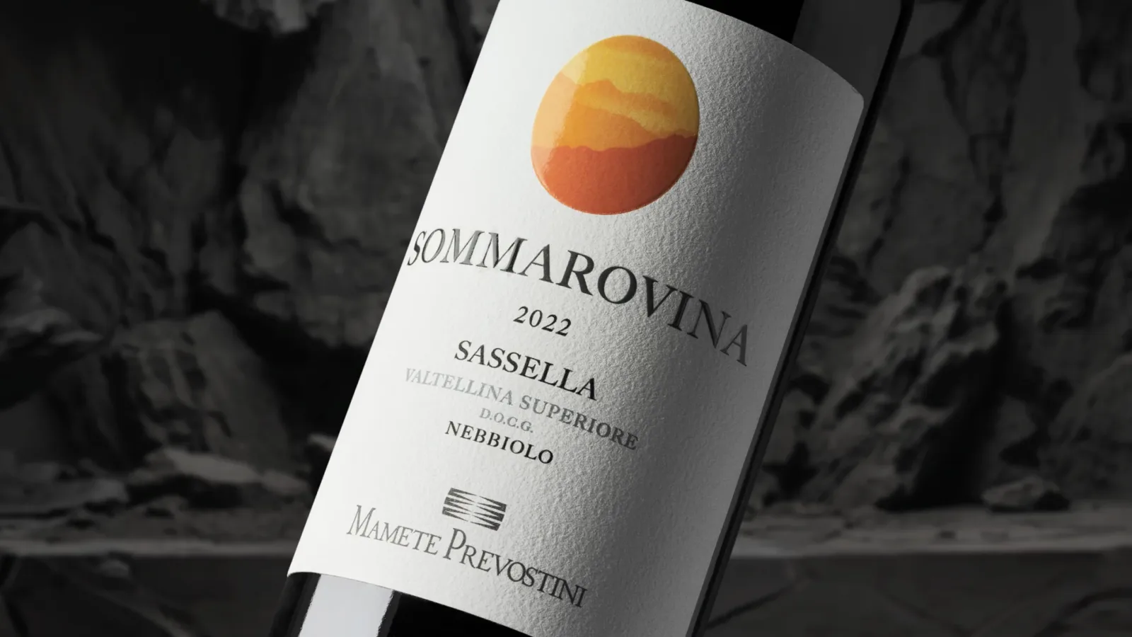
The distinctive element is the oval, which defines the entire line while evolving from one wine to the next: subjects and colours change to tell the wines apart, and some labels are enriched with glossy finishes.
On the most important wine, the Riserva, the evolution is even more radical: the label turns black, the oval is merely suggested, leaving room for a vivid red embossed graphic sign.
The more textured, ivory-toned paper amplifies the premium perception and clearly sets this line apart from the others.
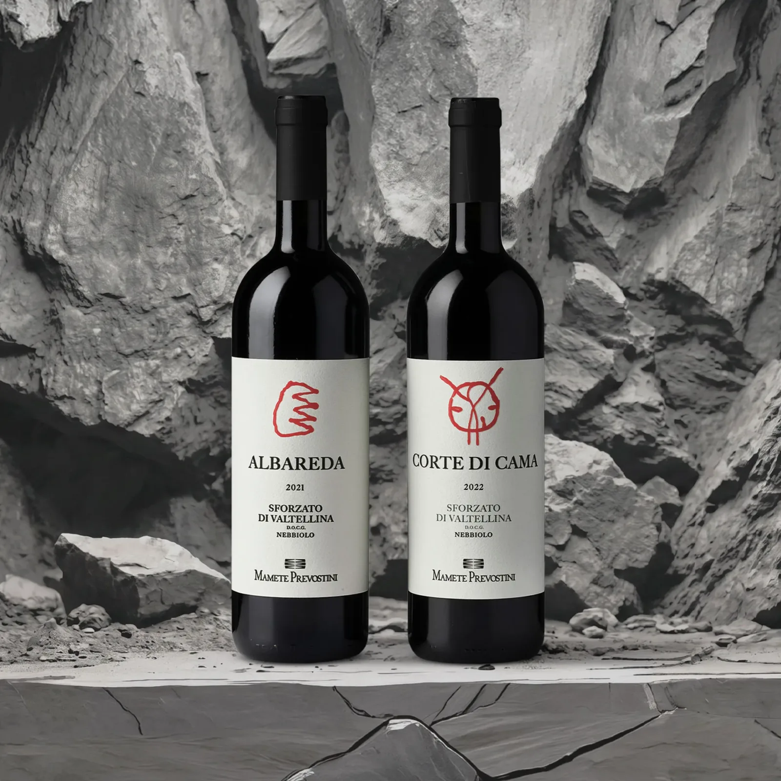
Linea Sforzati: ancestral signs and identity
For Corte di Cama and Albareda, the ancestral symbols were lifted out of the geometric shapes that previously enclosed them, gaining greater expressive power and distinctiveness.
Corte di Cama evokes the ancient courtyard and the passage of people.
Albareda recalls the concept of strength.
Both signs are enhanced by embossing and by the same textured paper used for Cru and Riserve, in keeping with the line’s premium positioning.
A more orderly, consistent and distinctive range
Overall, the restyling project has delivered packaging that can:
A far from obvious balance, especially in wine label design across different price tiers.
- Strengthen the visual consistency across the lines
- Maintain and clarify the different positioning levels
- Improve legibility and shelf impact
- Showcase each wine without losing the overall identity