

Sankt Pauls: Riserva range packaging restyling
- Client
- Sankt Pauls
- Project
- Packaging
- Year
- 2026
How do you enhance an outstanding wine without changing its identity?
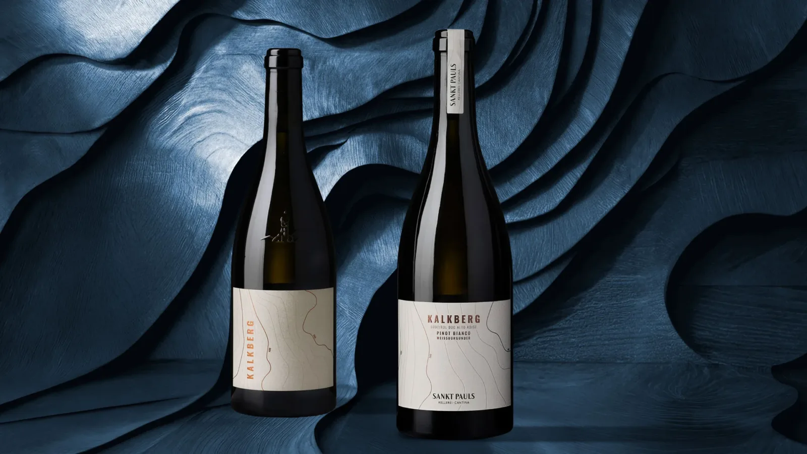
This is the challenge behind the restyling of the Sankt Pauls Riserva Alte Reben line, a range that includes some of the most prestigious expressions of the South Tyrolean winery.
Wines born from selected plots, long ageing and a constant pursuit of quality: bottles that tell the story of the territory through intensity, elegance and great ageing potential.
Continuing the work of harmonising the product portfolio to consolidate the brand and its premium positioning, we carried out a targeted evolution of the visual identity. Not a radical change, but a calibrated intervention: a restyling designed to raise perceived quality, improve legibility and make communication clearer and more effective, for both the trade and the end consumer.
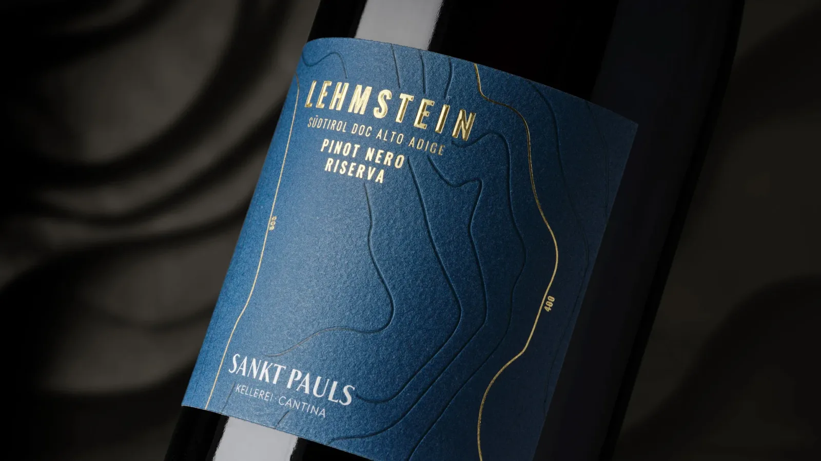
A balance between recognisability and innovation
The project was built around the goal of preserving the original spirit of the packaging while introducing innovative elements that raise its perception.
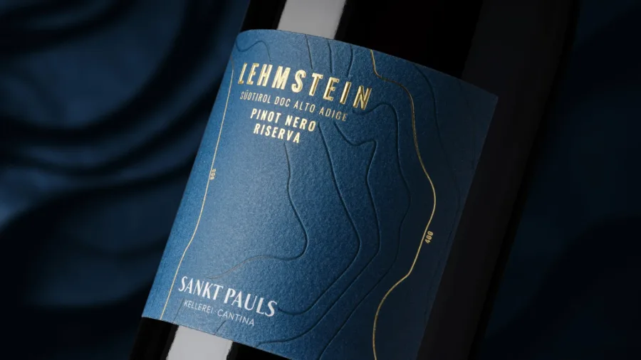
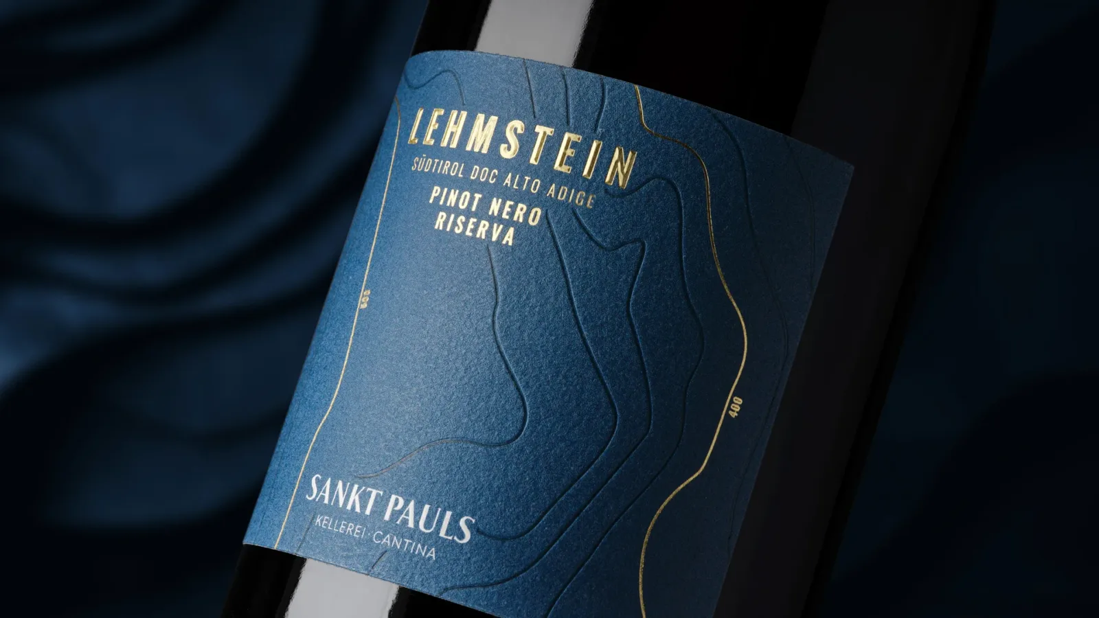
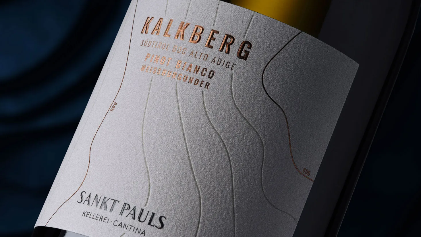
One of the key changes was placing the brand and the appellation on the front label, making the product more recognisable, immediate and effective across different commercial contexts.
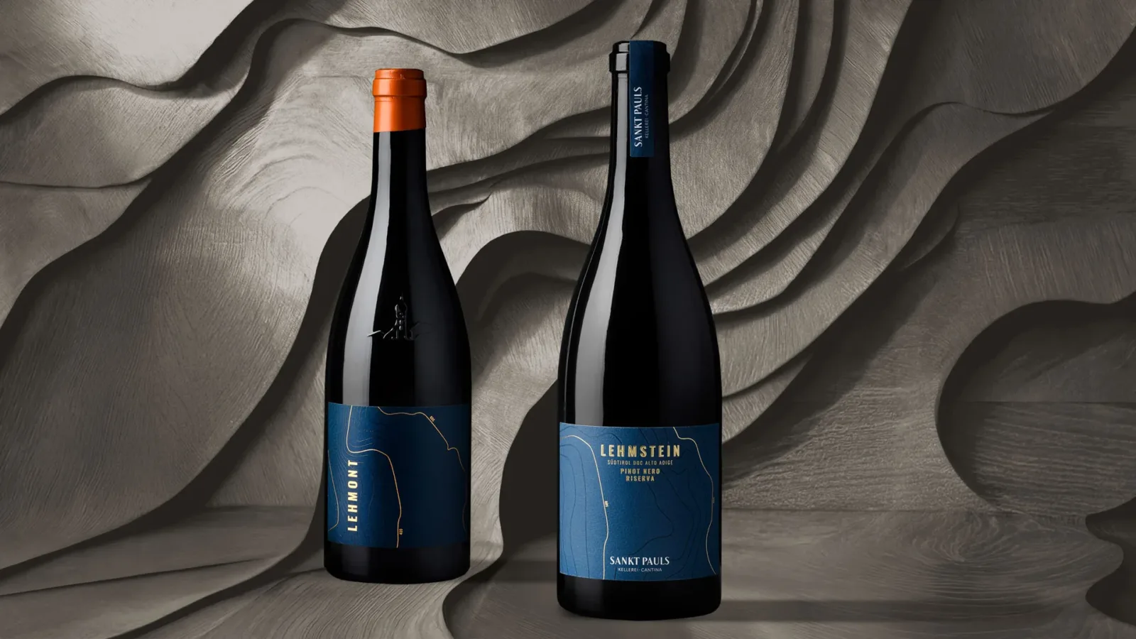
Materials and finishes: value you can feel by touch
In wine packaging, perceived value also comes from the material. For this reason the project introduced a significant evolution in materials and finishes, including:
-
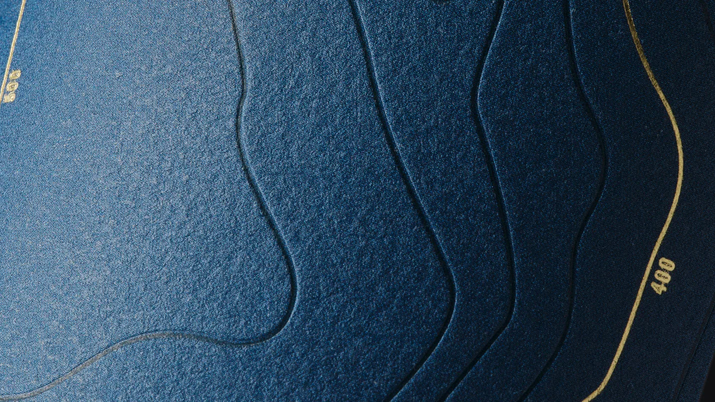
Premium paper
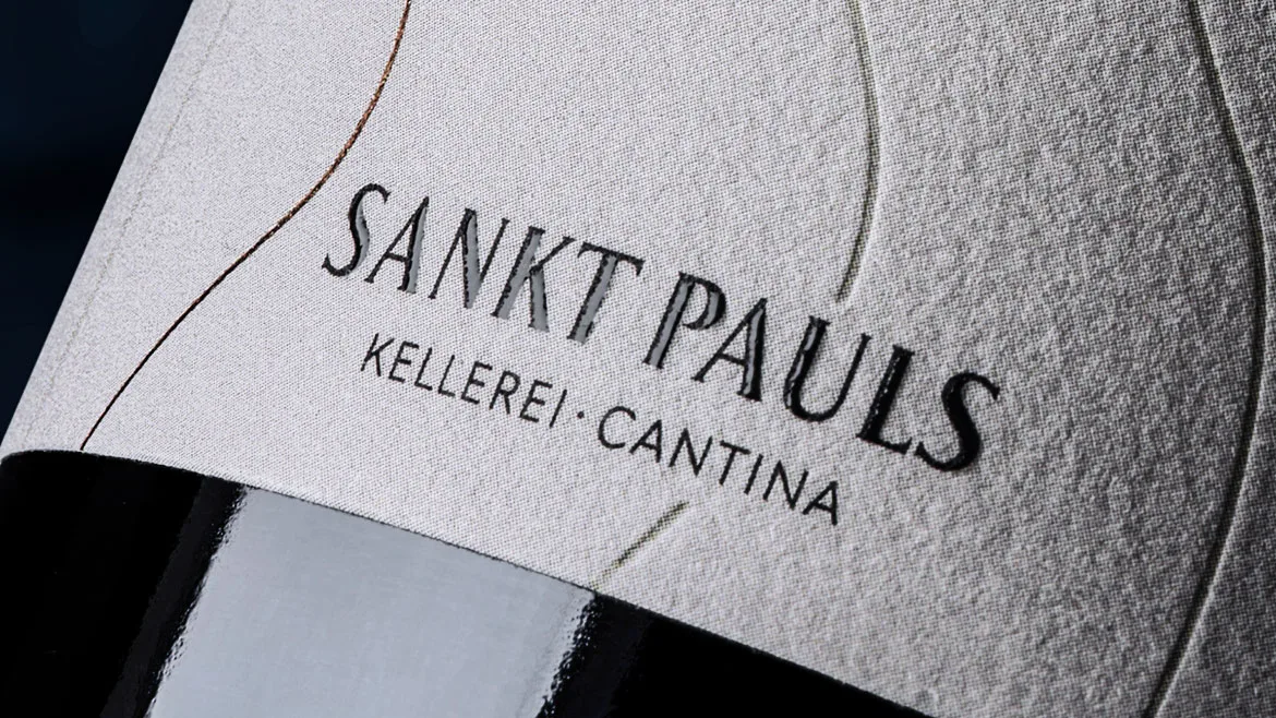
Fasson Cotton White Plus cotton paper, more premium and distinctive
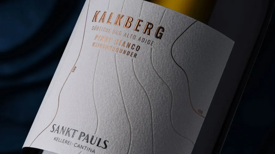
-
Debossing
which replaces the previous braille with a more refined, contemporary mark
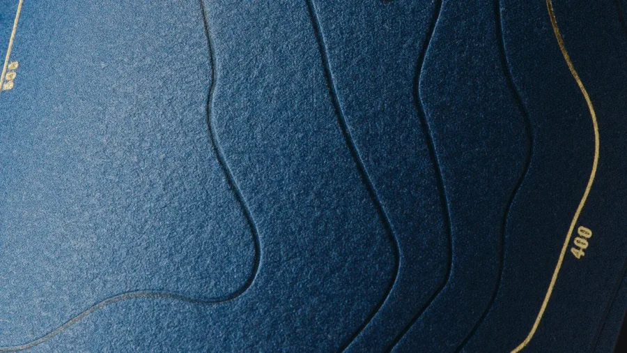
-
Hot foil
on both the product name (cusp-shaped) and the text, to improve legibility and perceived quality
-
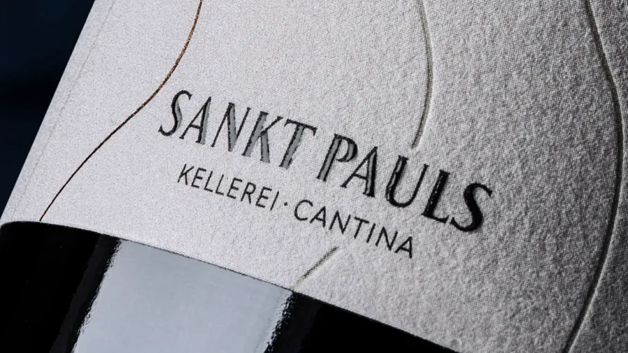
Braille effect
applied to the brand name, to enhance it further
-
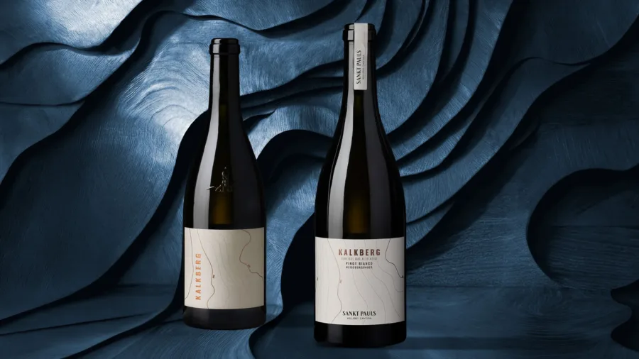
Neck band
in place of the previous capsule, for a more modern elegance
Colour as a distinctive code
Another key element of the restyling is colour: whereas the range was previously distinguished by just two variants (one for the whites and one for the reds), the new design introduces four distinctive colours, one for each wine.
A choice that strengthens the identity of the individual products, improves shelf recognition and makes the whole range more articulated and legible