
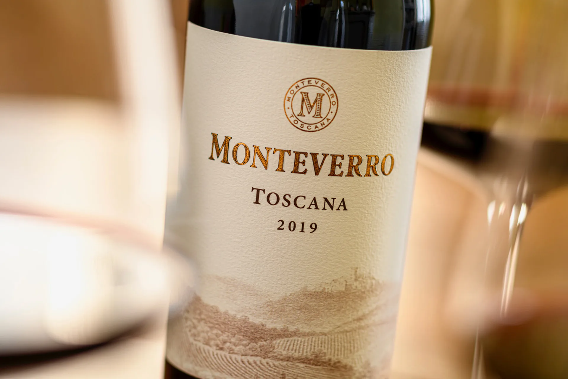
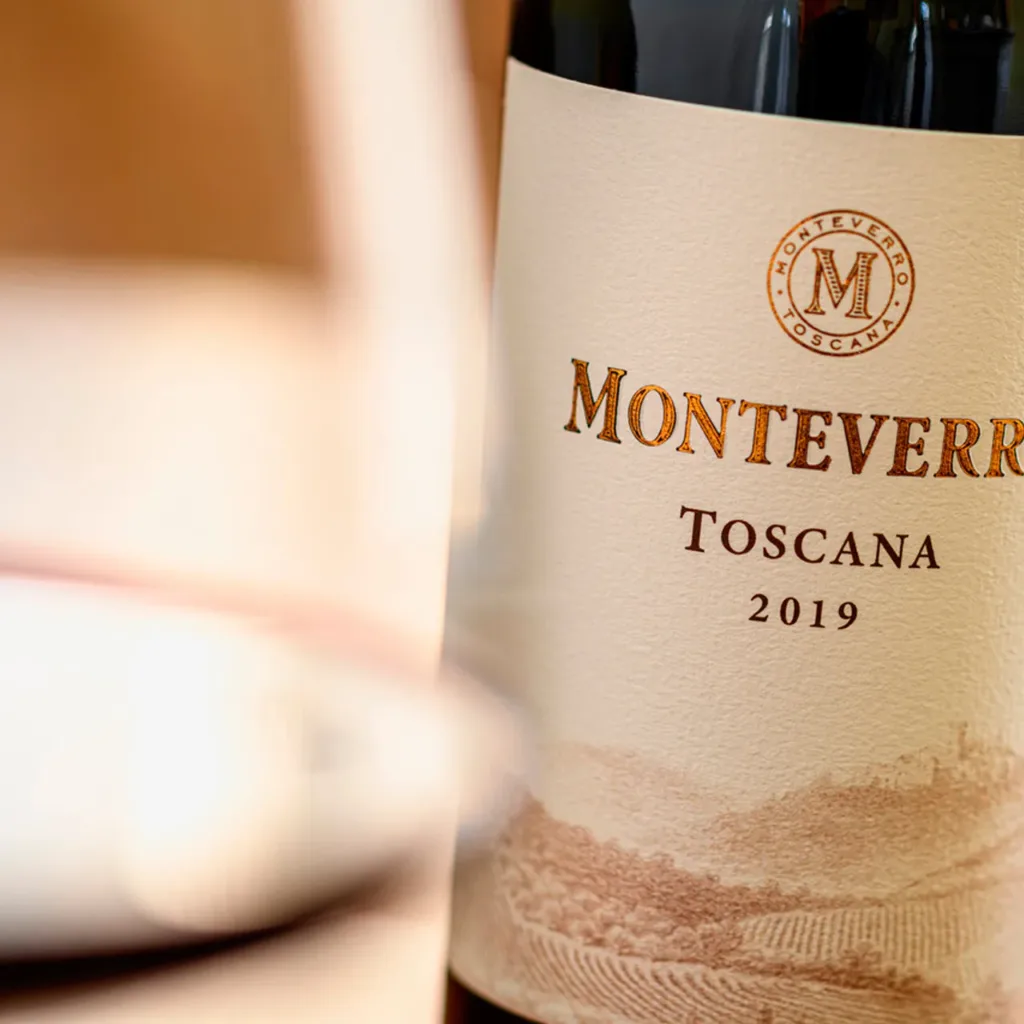
Lightness and the enhancement of the strong values that have defined the brand since its origins: these were the guidelines NSG followed in supporting Monteverro – a jewel of a winery in the heart of the Maremma – in the graphic revision of its product labels. The project sets out to tell the brand’s evolution through a visual reinterpretation of the first organically certified vintages: “Monteverro”, “Terra di Monteverro”, “Tinata 2019” and “Chardonnay 2020”.
“The aim of our graphic work on these wines, which have always been “dressed” in labels evoking the vineyards they come from, was to preserve their identity while giving it a new weight. We therefore worked by subtraction, lightening the lines and focusing on simplification, choosing legible fonts in which, for example, italics are abandoned in favour of a more contemporary and clear style. In the name of elegance and refinement, guided by the pursuit of essentiality, we also lightened the logo, freeing it of its background colour so that the “M” emerges powerful but not intrusive. To convey the value of these wines, which rank among the finest in Tuscany, we also chose a very fine paper that could represent the excellence of the product”, explains Luca Mancini, CEO of NSG.
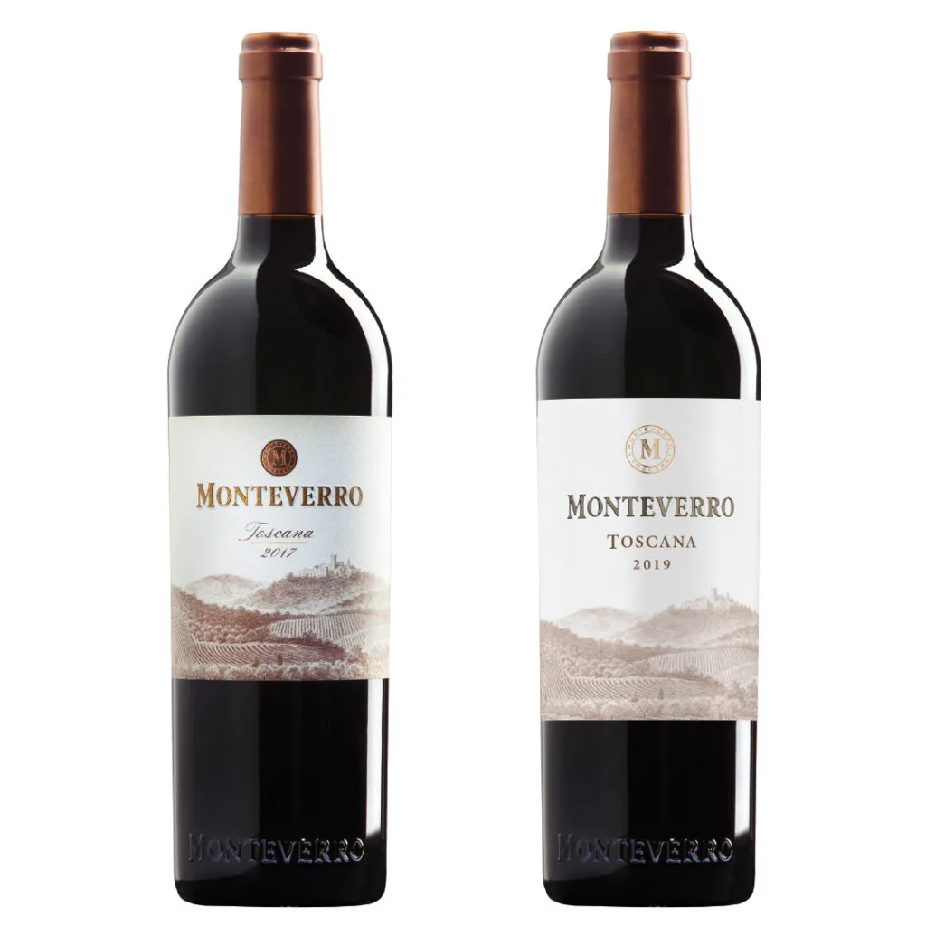
The result is an aesthetic change that does not undermine the winery’s underlying philosophy, but makes it more contemporary and more narrative. “The goal we wanted to achieve was to create a more contemporary, lighter logo, a mirror of our philosophy, which sees the estate – the winery, the vineyards and the team – as a synergistic and harmonious system of which the wines are the expression, an immediate idiom for engaging with our audience. This transformation at the visual level shows how we have evolved and how the winery has an increasingly contemporary soul, while keeping its roots in the territory and in tradition”, confirms the Monteverro marketing team.
Balance, harmony, passion and love, but also respect for nature, are the key words of this evolution, which is also evident in the brand’s new image.
Looking for an agency to handle the communication concept and the design of your products?
Get in touch!