
Wine Packaging Restyling for Centinari
- Client
- Centinari
- Project
- Packaging · Restyling
- Year
- 2025
Packaging restyling for Centinari
Restyling goals: elegance, consistency and visual identity
Centinari Franciacorta, a Togni Group brand, stands for refinement and dedication in the production of premium sparkling wines for the Horeca sector.
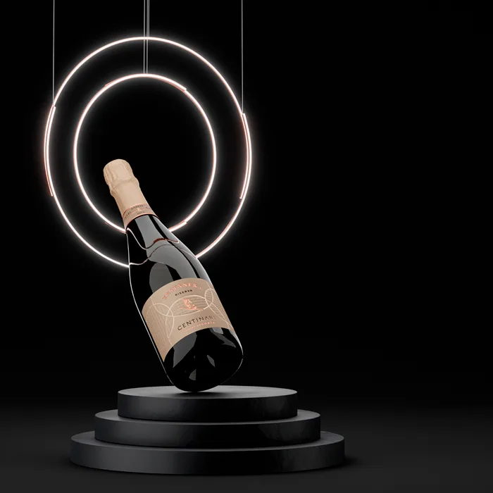
To bring order and continuity to the different product lines (base, vintage and reserve), we undertook a packaging restyling project based on the label design of the “Testanera” Riserva, the winery’s flagship product launched in 2023.
In particular, the focus was on:
The steps of the label restyling
- Defining a coherent corporate colour palette
- Setting precise rules for applying the logo and the circles, the distinctive graphic elements of the label design
- Creating a common thread across the product lines while keeping each label design recognisable
A tailor-made visual language: wine label design between style and visual hierarchy
We worked to create a common thread by defining coherent brand colours, choosing a single paper for all the dress (pearlescent and embossed) and setting precise rules for the use of the brand and the graphic lines.
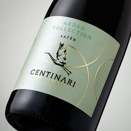
We defined a colour palette for the label design that reflects the brand’s high positioning: red, black and gold as the main colours, with grey, antique pink and mint green for a touch of refinement and elegance.
A visual story for every line
To set the base and vintage lines apart from the Riserva, we worked on every element of the packaging: from the length and colour of the capsule to the neck label, down to the label design itself.
We created a coherent, distinctive visual identity for each line by playing with the arrangement of the circles and the different sizes of the brand, in order to tell the story of the evolution and emphasise different aspects.
Packaging design for the Testanera Riserva
Four interlocking embossed circles, together with a rich embossed decorative texture, enrich the entire packaging. The brand, at the centre of the intersections, does not dominate while remaining clearly visible, so as to highlight the product and its excellence.
Restyling of the Millesimati line
Two circles move apart while two remain intersected. The partial presence of the decorative texture and a medium-sized logo balance the attention between brand and product.
Restyling of the Base line
The spaced-out circles and the absence of the texture leave room for a large logo, which stands out fully and draws the eye entirely to itself.