
Wine Label & Packaging Design for Grafical
- Client
- Grafical
- Project
- Packaging
- Year
- 2024
Packaging design: Siamo Forty project
For the 40th anniversary of Grafical, NSG took part in the “Siamo Forty” project alongside three packaging design agencies. The brief was to create a celebratory label for a bitter centred on the history and personality of Grafical, highlighting the printer’s technical skills.
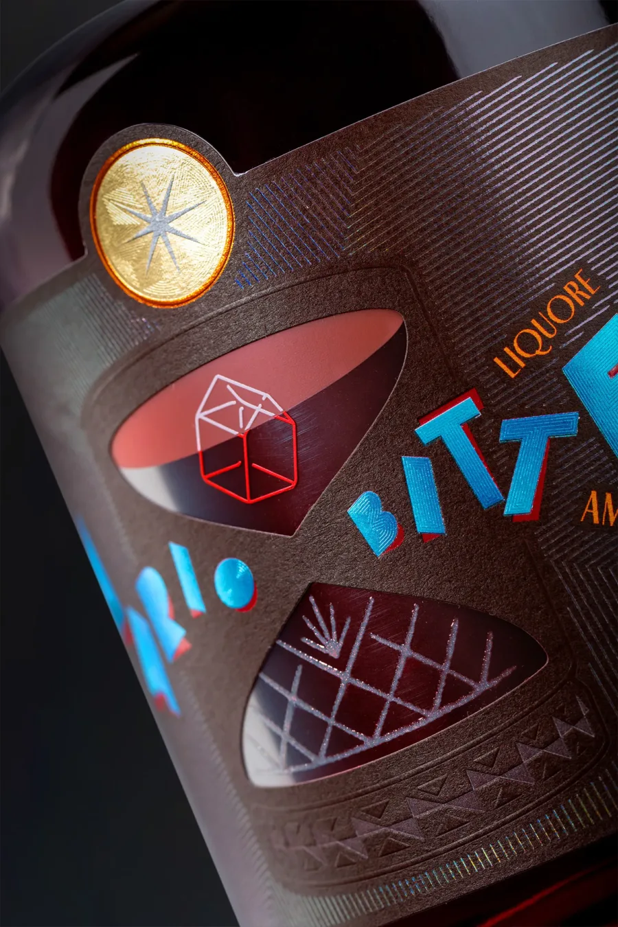
The design, the result of collective brainstorming, is inspired by the anecdote-theme “From rags to riches” (in Italian, “Dalle stalle alle stelle”, literally from stables to stars): initially, thanks to the entrepreneurial intuition of founding father Andrea Lonardi, the company’s first premises were set up in a stable owned by the family. With the success of the venture, the determination of later generations to carry on in the best possible way and a touch of luck in a move resolved “on the stroke of midnight”, the company found its definitive home in a warehouse. Hence “From stables to stars”, in which the symbolic narrative explores the concepts of time and evolution, incorporating elements from the world of bartending and mixology.
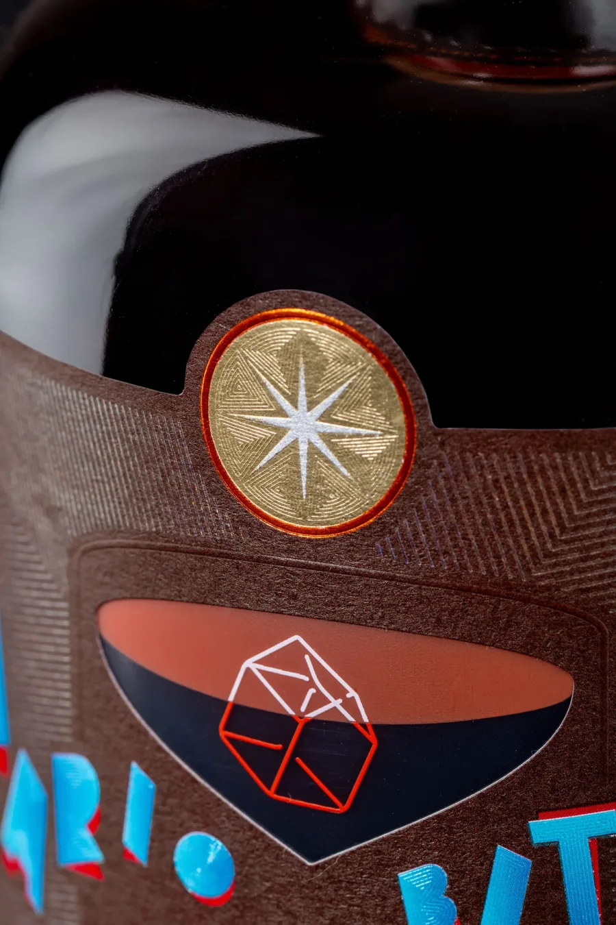
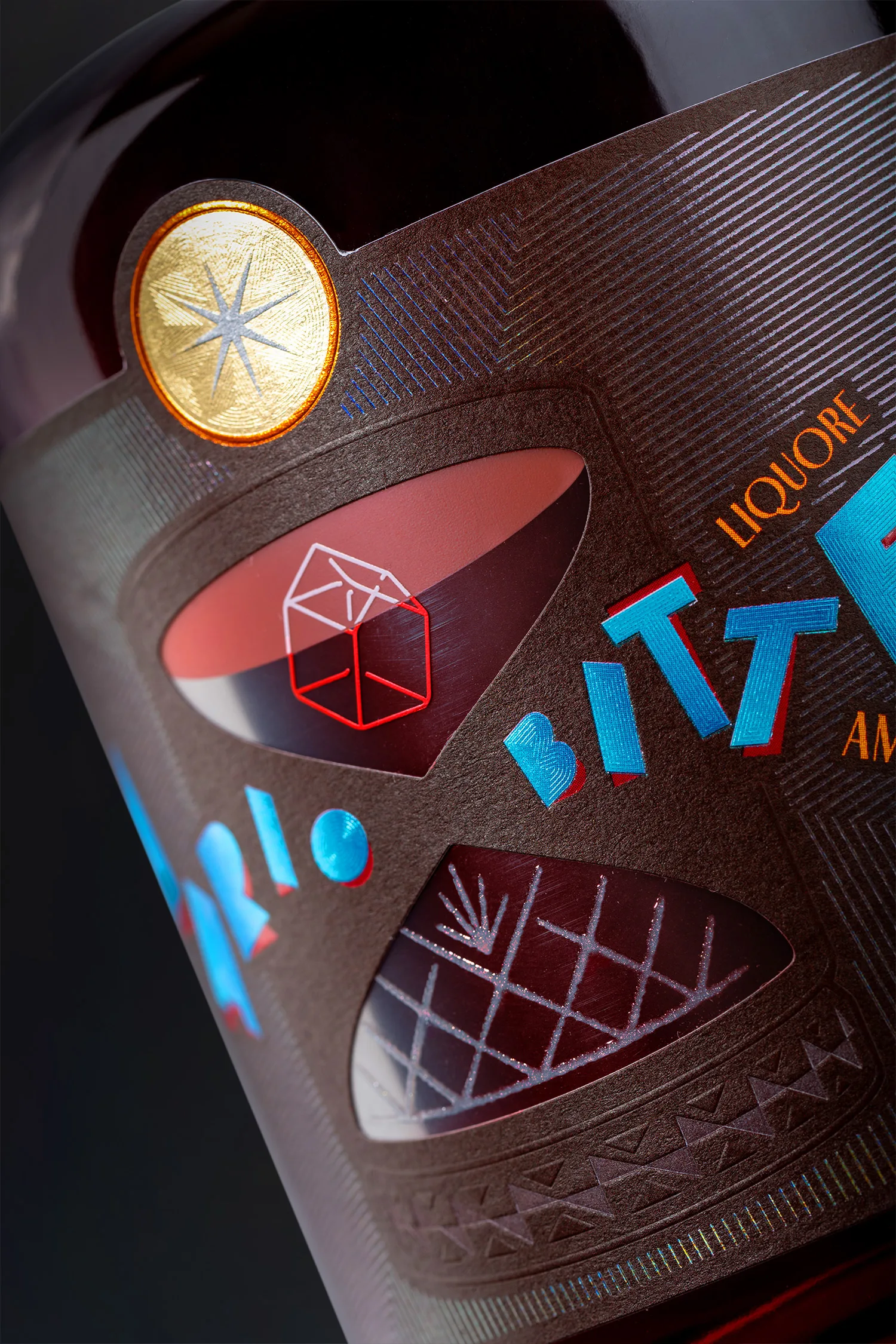
The label offers two ways of reading, starting with the vertical one, which leads the eye from the ice cube, similar in shape to a “stable”, up to the circle at the top obtained from the cut of an orange, the unmissable cocktail garnish that here plays the role of the “star”.
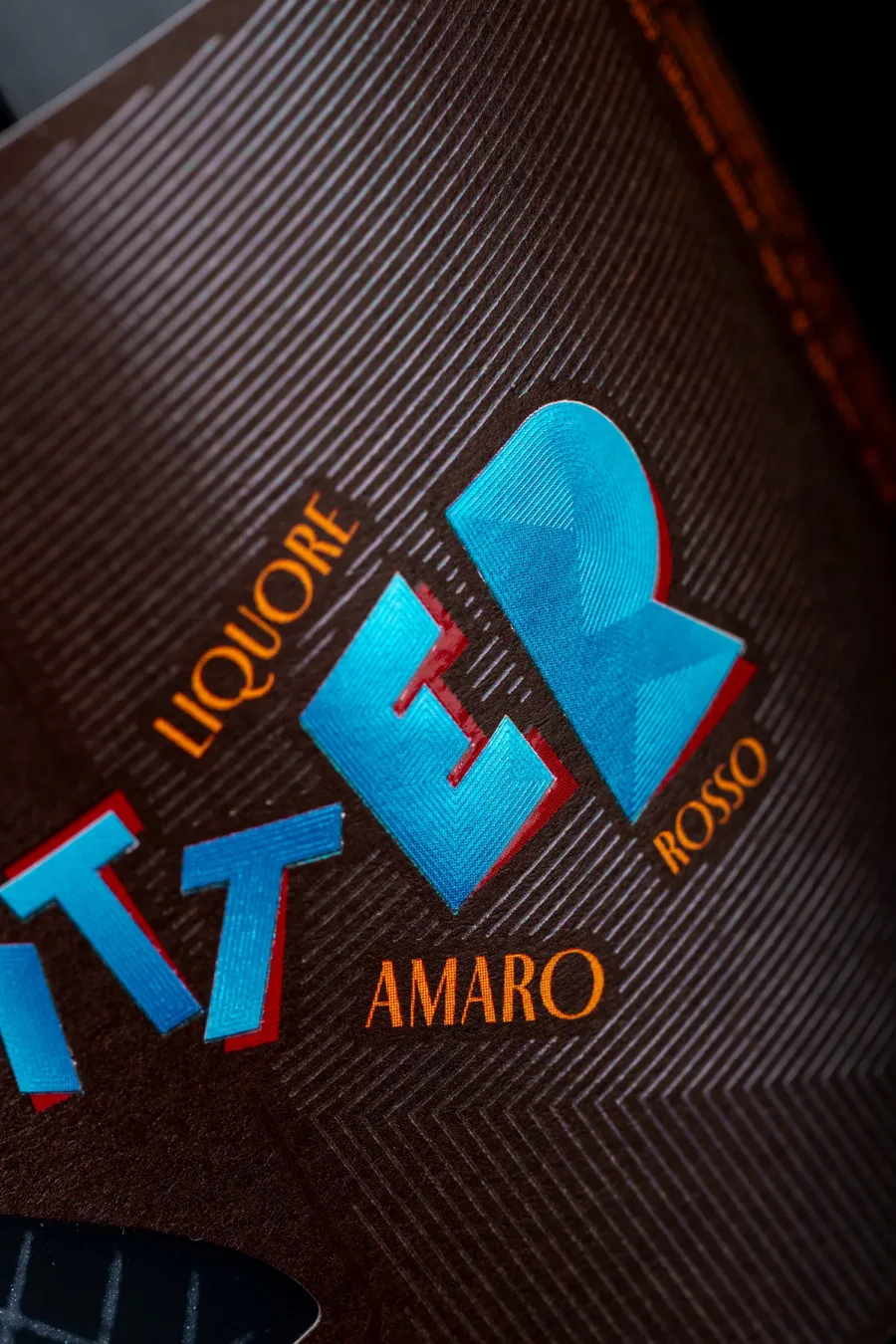
Moving to the horizontal reading, the eye shifts to the naming and product denomination, where the name “Amario” combines “Mario” and “Amaro” (Italian for bitter), playing on assonance and paying tribute to one of Andrea Lonardi’s brothers: Mario. Finally, the lettering, inspired by Fortunato Depero’s futurist advertising posters, blends a vintage soul with a fresh, modern character through colour contrasts.
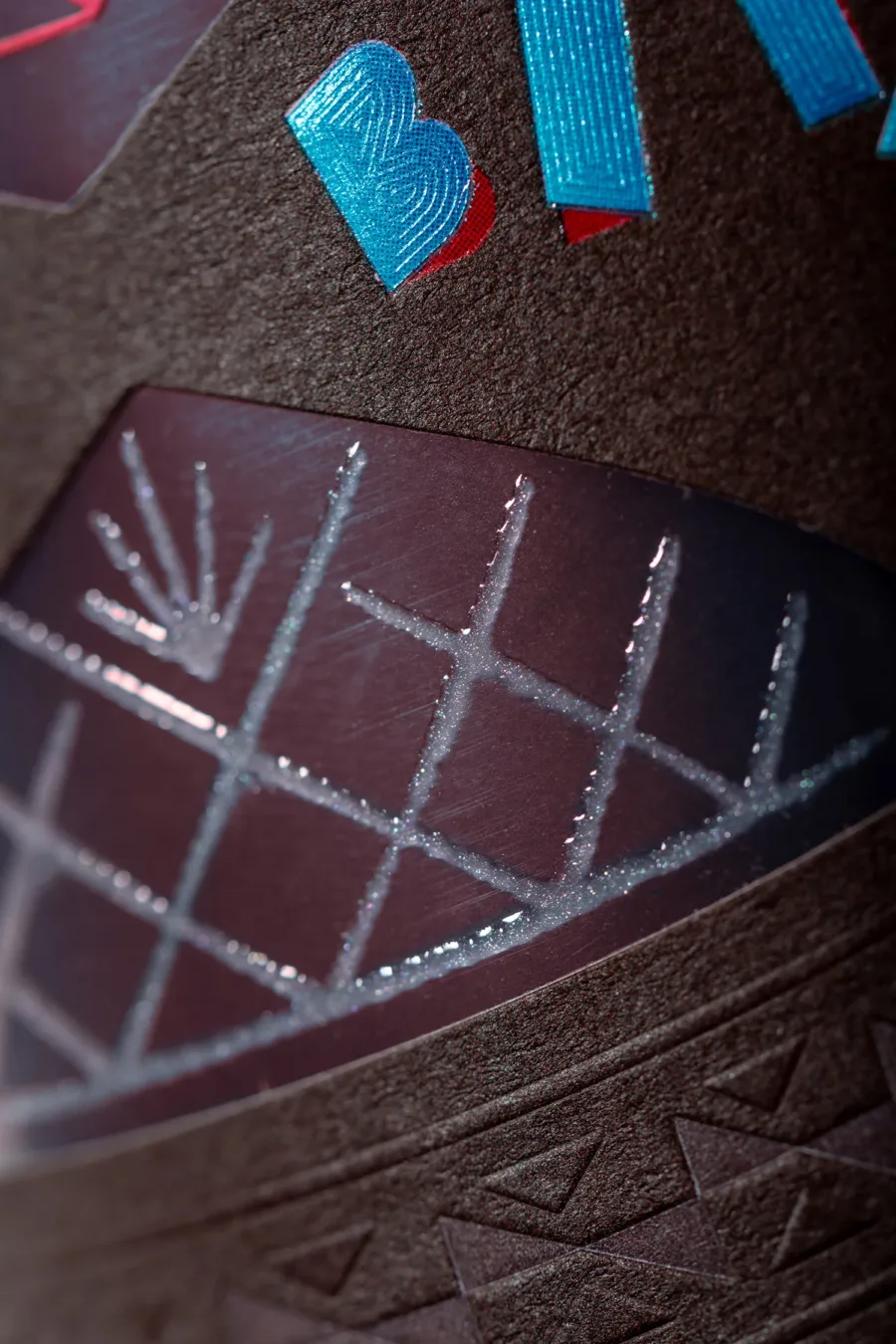
The “old fashioned” glass, a protagonist with a timeless design, incorporates a perforated section that recalls both the shape of a cocktail jigger and that of an hourglass, the ultimate symbol of the passing of time. The dark brown background of the paper, combined with the light blue of the lettering, evokes the elegance of 1920s Belle Époque bars and the typesetter’s drawers for movable type.
Enriched with numerous finishes including details in four different coloured foils, embossing, debossing, nano-engraving and glossy screen-printed varnish inserts with Iriodin, the label is designed to make an impact, suited to a limited edition but also to a marketable product, and able to showcase all the technical possibilities on offer, both in production and in demonstration at the celebratory event.