
Wine Label & Packaging Design for Kettmeir
- Client
- Kettmeir
- Project
- Packaging
- Year
- 2024
Wine packaging design
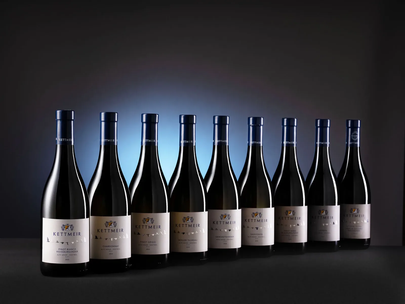
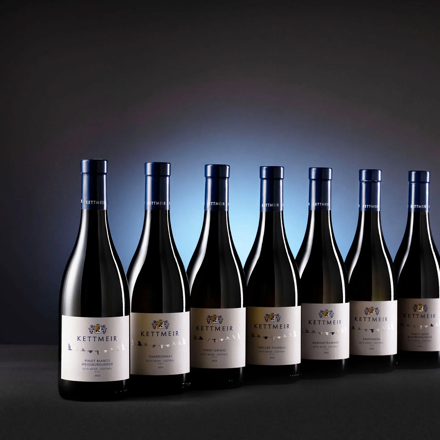
A historic winery in the heart of South Tyrol and keeper of ancient know-how, projecting itself towards the future while keeping a strong bond with its territory, Kettmeir turned to NSG to create a stronger visual identity for the “I Classici” range, with the aim of giving the packaging a sense of freshness and contemporaneity, preserving its strong sense of place while increasing perceived value.
Hence the development of an essential graphic language that communicates the key concepts of elevation and elegance in a contemporary voice.
The new symbol is a bird species typical of South Tyrol that migrates to Lake Caldaro: the osprey (Pandion haliaëtus). A unifying element across the packaging, the flight phase is further enhanced by giving a different colour to a single wingbeat, which in turn personalises each wine in the range.
The raptor’s ascent to great heights represents and expresses the brand’s mission and values: the pursuit of progress goes hand in hand with excellence.