
Wine Label & Packaging Design for Peaks and Valleys
- Client
- Peaks and Valleys
- Project
- Packaging
- Year
- 2025
Peaks & Valleys: the wind that tells the story of Veronese wine
A visual identity project for the Marilisa Allegrini brand
Peaks & Valleys is a new project that redefines how the Verona wine territory is told. A visual identity born from the vision of Marilisa Allegrini and her family, in collaboration with Master of Wine Andrea Lonardi.
The Peaks & Valleys symbol draws inspiration from the alternating profile of the peaks and valleys that run parallel from north to south behind Verona. An essential graphic sign that reflects its unique identity.
To bring together under a single brand wines from different appellations of the Verona area (Valpolicella, Lugana and Soave), enhancing their identity through a common and distinctive visual language.
A “Scattered Vineyard” project that connects the three great appellations of Verona: Valpolicella, Lugana and Soave.
A mark that visually interprets the profiles of Verona’s peaks and valleys, enriched by the payoff “Verona’s Landscape”, the perfect synthesis of the area’s winemaking soul.
When Andrea proposed this project to us, my family and I immediately recognised ourselves in the production idea behind it. At the same time, it was necessary for the project to be told, and to be tellable, through its packaging, the first impact on the final consumer. So we decided to entrust the project to NSG, an agency we have worked with for a long time and with which, for this project too, we built a continuous dialogue, the result of mutual trust and an exchange of ideas.
A brand that tells the story of the land
What is the aim of the project?
Caterina Mastella Allegrini
The element that unites all the Peaks & Valleys appellations is the wind. An invisible but essential element, able to shape the landscape, influence the microclimate and define the character of the wines.
The wind becomes sign, matter and symbol, turning into a graphic story that celebrates the distinctiveness of each appellation:
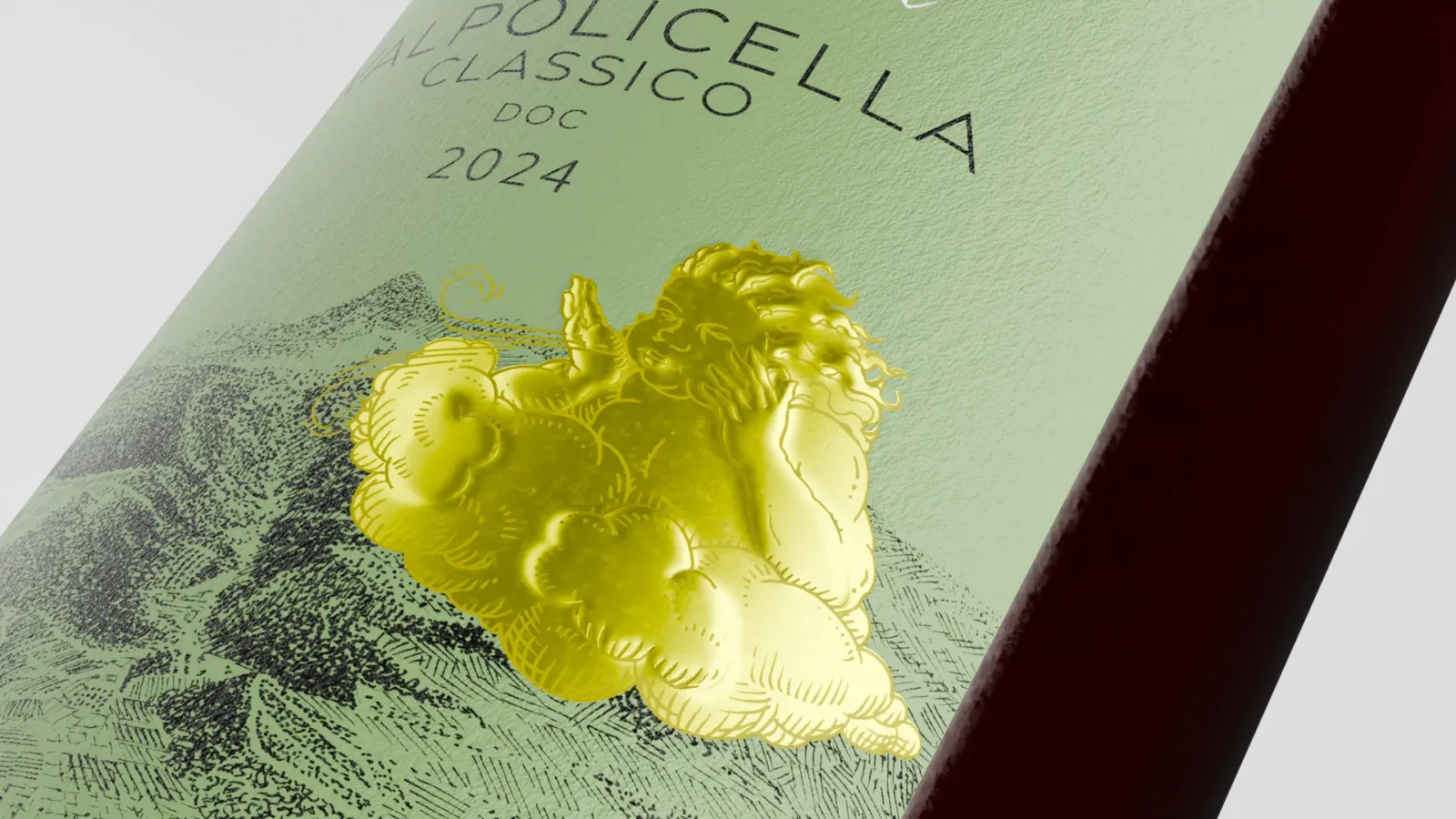
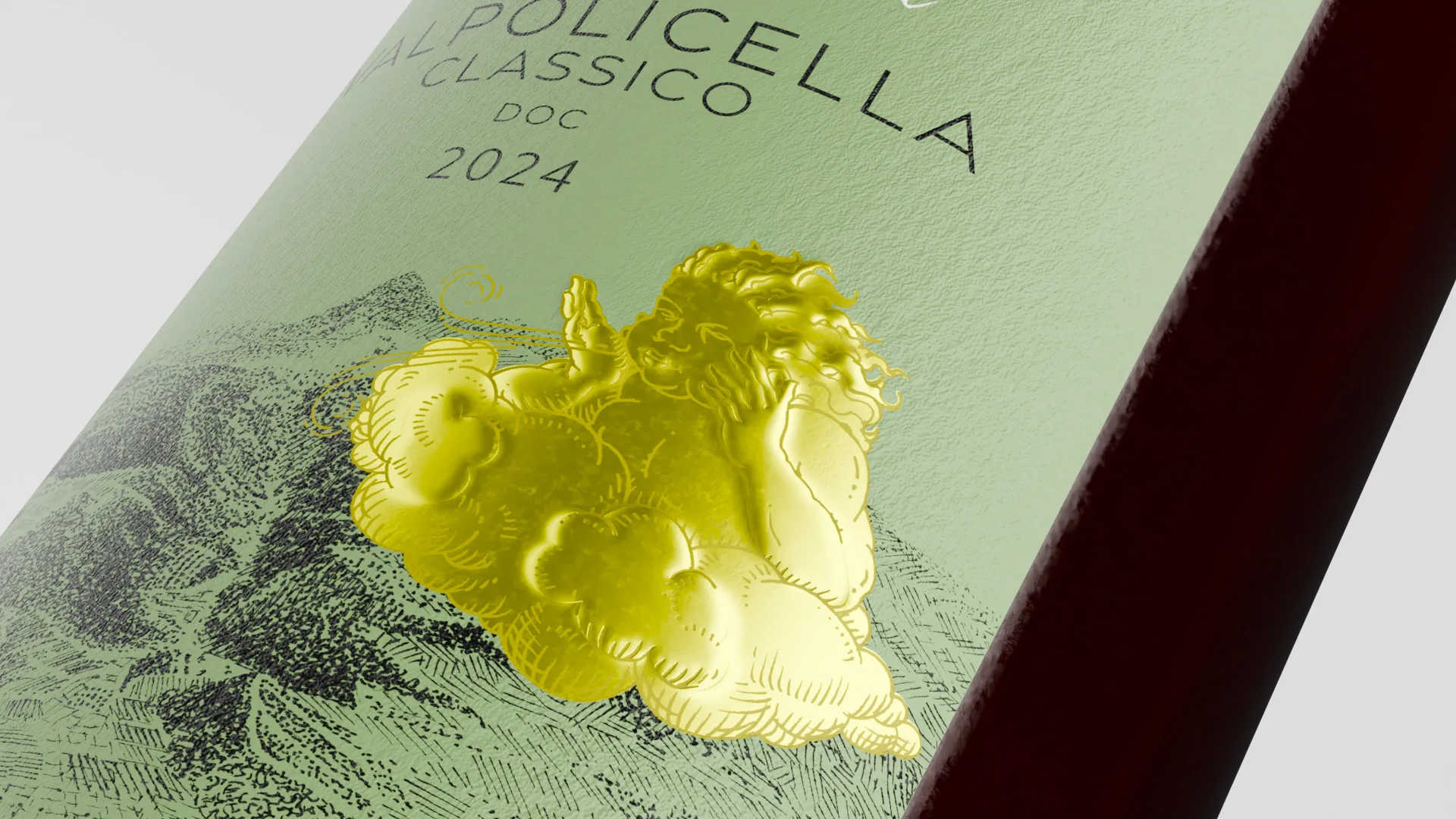
Valpolicella Classico – Monte Lencisa (Fumane)
In this valley the Venturi effect occurs, an acceleration of the wind caused by the shape of the land. Here, Aeolus, god of the wind, is depicted in micro-engraved foil, his breath following the movement of the air in the Venturi tube, telling of the vitality and freshness of this wine.
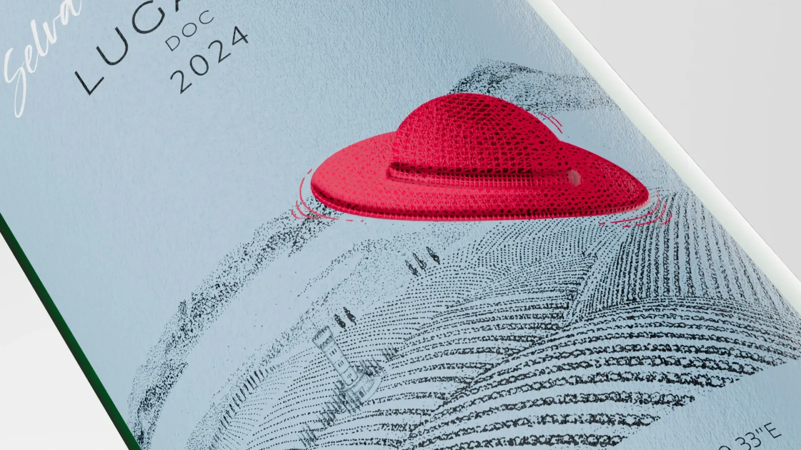
Lugana – Selva del Vescovo
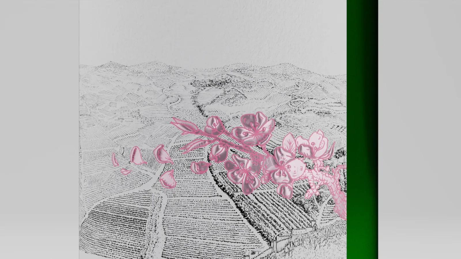
Soave Classico – Castelcerino
Here the wind caresses cherry blossoms, a symbol of the delicacy and elegance that characterise this wine. The foil detail strengthens the link with nature and with the spring bloom that transforms the landscape.
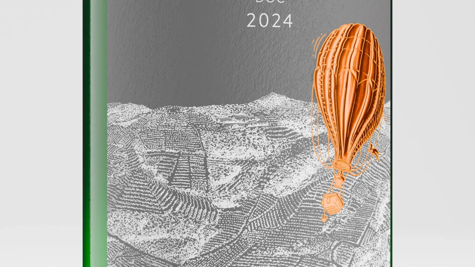
Soave Classico – Fittà
The hot-air balloon becomes the perfect metaphor for the interaction between wind and heat: hot air lifts it, just as ancient volcanic eruptions gave rise to the soils of this area. The flame that heats it recalls the primordial force of the volcano, the same energy found today in the wines of Fittà.
Materials, relief and details that define the brand
The aim was not just to create a visual identity, but a tactile and perceptual experience, in which materials and finishes reinforce the brand’s premium positioning. A sensory synthesis, an experience that engages touch, light and graphic sign to tell the deep bond between wine and land.
Hand-drawn illustrations
Each label is enriched by illustrations by Antonio Bonanno, which depict the territory with fine, refined lines, in perfect balance between tradition and modernity.