
Wine Label & Packaging Design for Prediomagno Aquila
- Client
- Prediomagno
- Project
- Packaging
- Year
- 2022
Wine packaging design
Powerful, divine, undisputed ruler of the skies, the heraldic symbol par excellence of kings and emperors and a synonym of the victory of good over evil: the eagle. To develop the Prediomagno brand we drew inspiration from a piece of contemporary goldsmith art owned by the D’Aprile family, who own the company.
The design of the Prediomagno label range
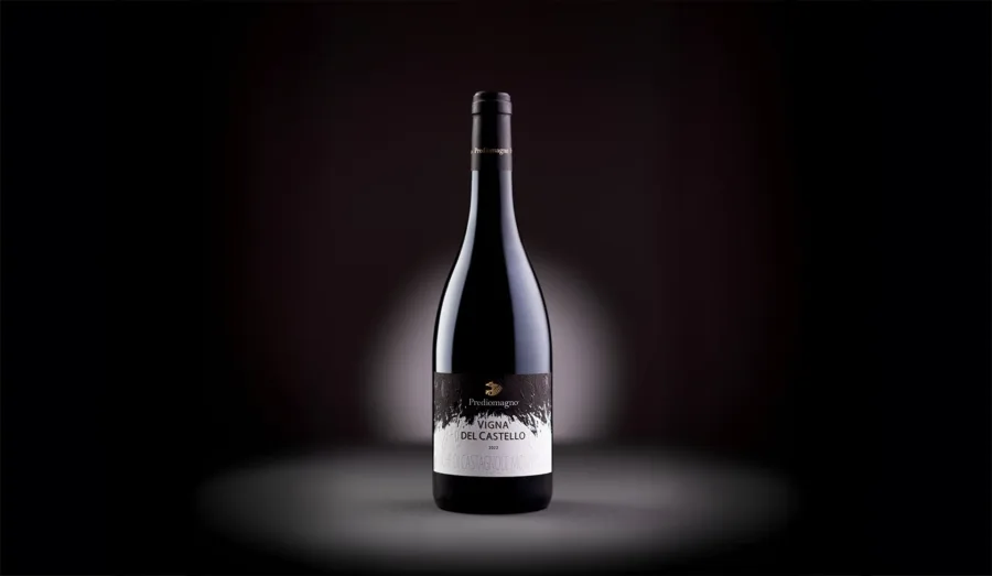
The Prediomagno winery is located in the hills of Basso Monferrato, a land where the art of falconry has been practised since antiquity. The concept we started from to develop the label range draws on this deep-rooted local tradition and led to a graphic reinterpretation of the plumage of birds of prey.
The link with falconry was immediate: practised since the Middle Ages by nobles and knights but also widespread among the Arabs and the nomadic peoples of Central Asia, it is a hunting art that makes use of different types of raptors.
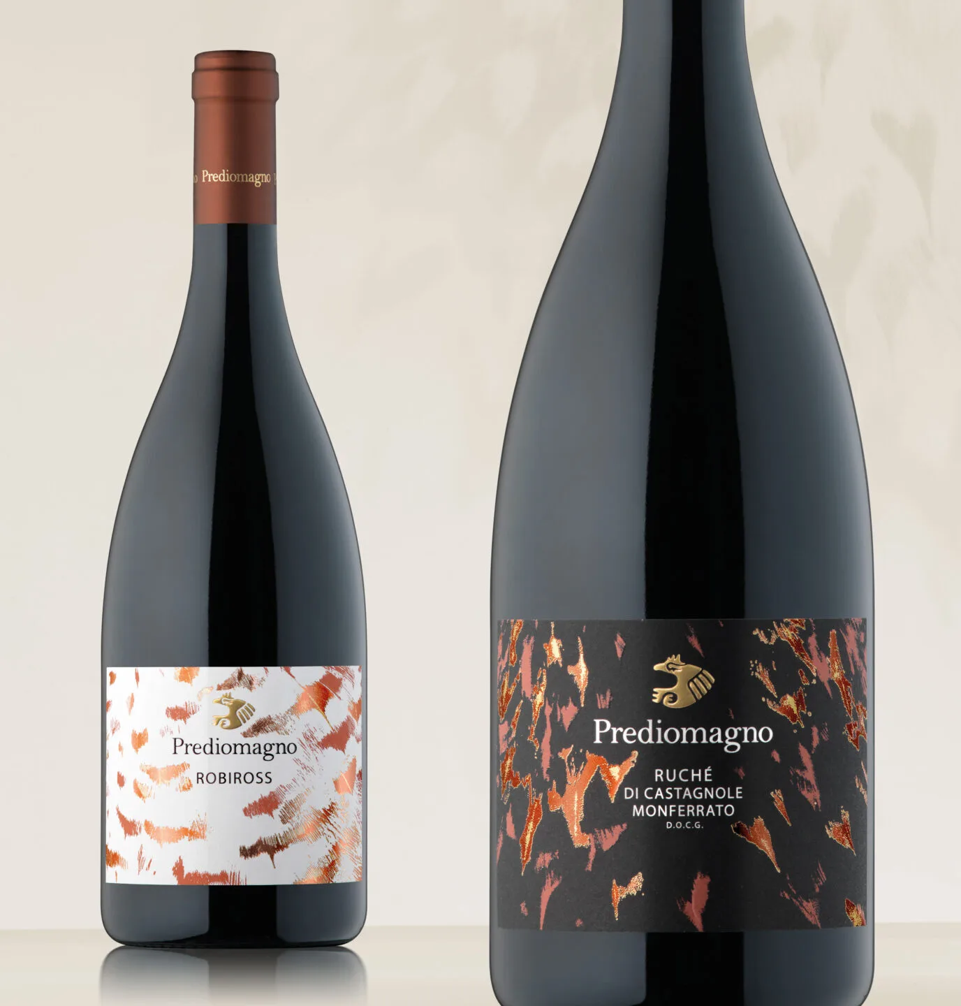
A different bird has been assigned to each wine, and colour variants have been designed that help express the uniqueness and character of each wine. The complexity of the plumage is reflected on the labels through the technique of overprinting on hot foil.
The bottle packaging was inspired by hawks, buzzards, sparrowhawks, kestrels, kites and, of course, eagles, whose different plumages, in shape and size, became the distinctive trait of the labels, of the product lines, and a corporate leitmotif.