
Villa della Torre: a dialogue between history and modernity
- Client
- Villa della Torre
- Project
- Packaging · Restyling
- Year
- 2025
The restyling of a timeless identity
Villa della Torre, a jewel of the Italian Renaissance, is a place where history, matter and light intertwine, creating a unique aesthetic and sensory experience.
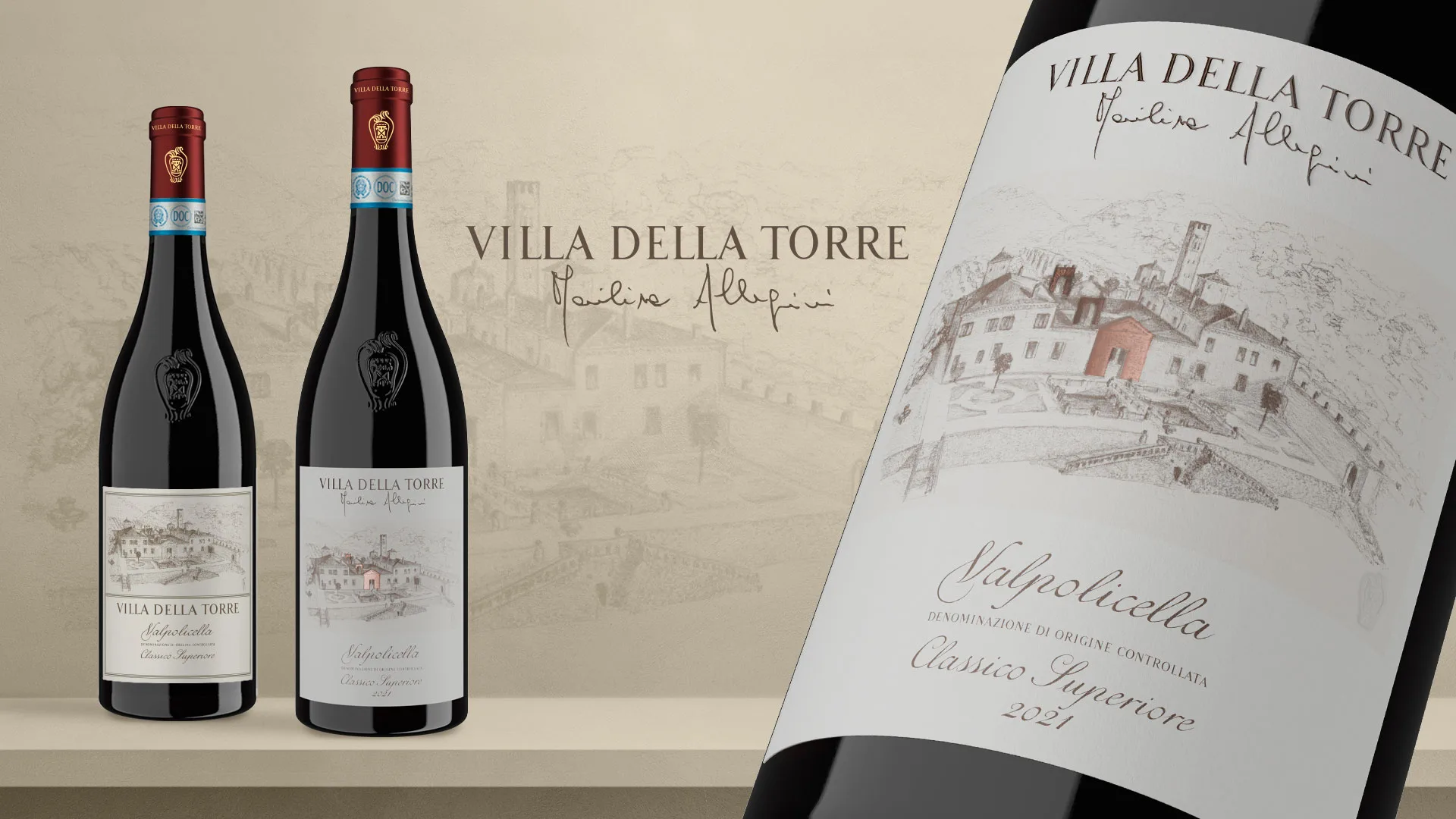
The label restyling was created to give these wines a new voice, keeping the bond with the estate’s architecture intact and projecting it into a new visual dimension.
An Amarone that breaks the mould, vibrant and savoury, moving beyond traditional opulence.
A Valpolicella inspired by architecture, balanced and refined, the expression of a new winemaking language.
A timeless visual identity, where classicism meets modernity, giving life to sophisticated and distinctive communication.
The Villa della Torre labels are not mere graphic elements but a material extension of the villa itself. Every detail is a bridge between past and present, a fragment of its history brought to life through the packaging.
A restyling between history and vision
Design and identity: the Villa della Torre label restyling
Matter, light and relief: architecture becomes a label
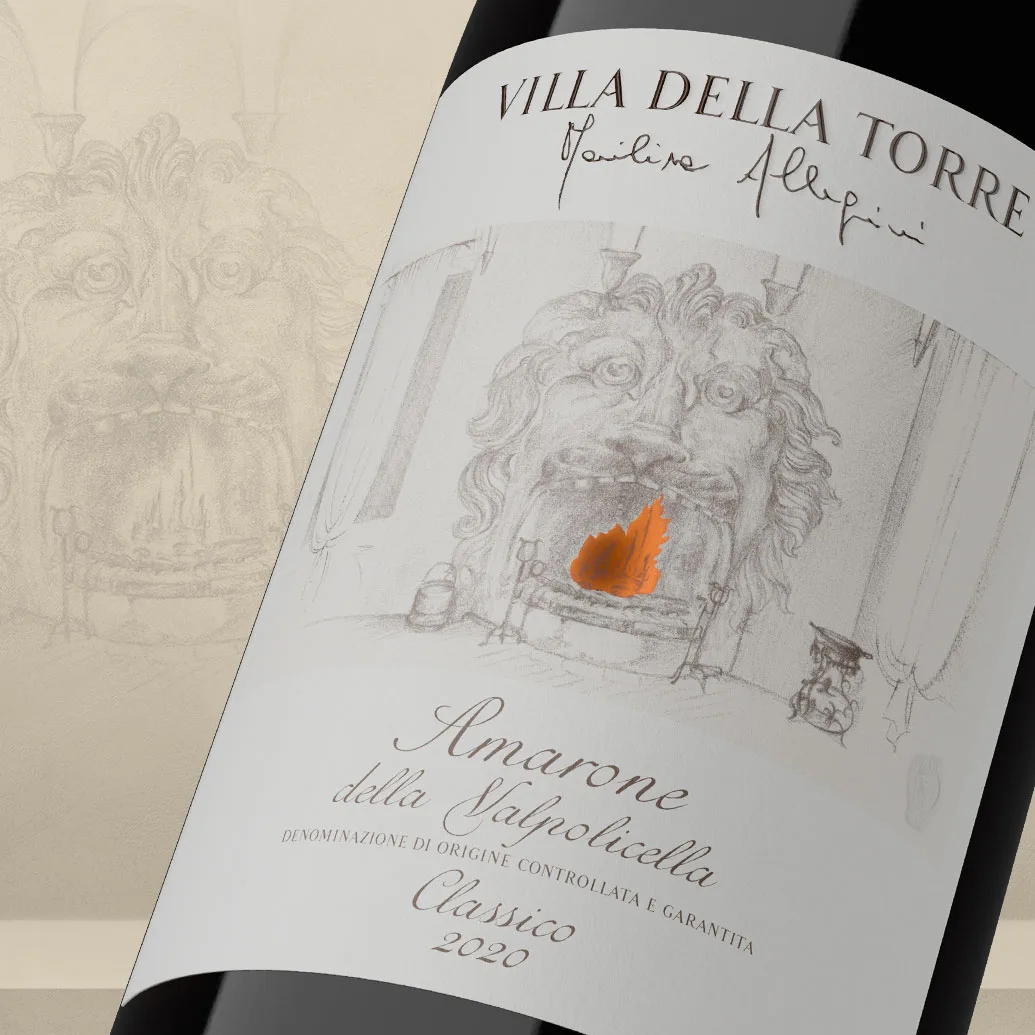
An Amarone that embodies the warmth of fire
Amarone della Valpolicella Classico is a wine of intensity and depth. To translate its character visually, the Lion’s fireplace at Villa della Torre was chosen as the central element of the label. Fire, a symbol of transformation and energy, is reproduced in metallic foil, creating vibrant reflections that change with the light.
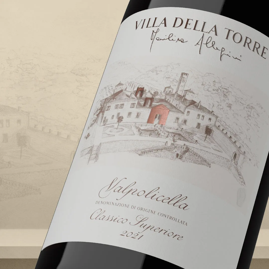
A Valpolicella inspired by the monumental portals of the Villa
Typography, relief and sensory details: the language of design
The visual identity of the Villa della Torre wines is a multisensory experience, where touch, light and graphic sign combine to express prestige and authenticity. Each label is designed to convey identity and value through refined details ( layered graphic to be inserted here to explain the elements )