
Wine Packaging Restyling for Sartori
- Client
- Sartori
- Project
- Packaging
- Year
- 2024
Packaging design
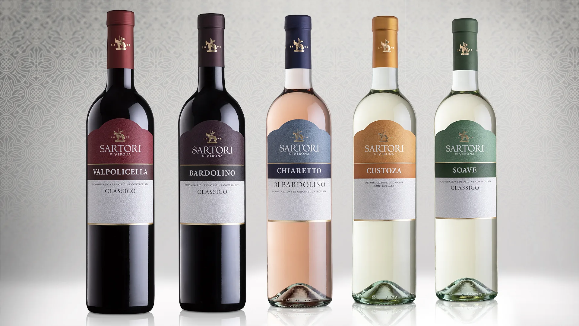
The restyling project for the “Classici Veronesi” range celebrates the roots of Casa Sartori 1898, reflecting its history through a few elements that identify the city of Verona.
The origins and simplicity of the brand are expressed throughout the project, starting with the die-cut, which reproduces the characteristic silhouette of Verona’s medieval Scaliger Tombs, down to the lower part inspired by the embroidery on the cloaks of Cangrande della Scala, who is also the brand’s main symbol.