
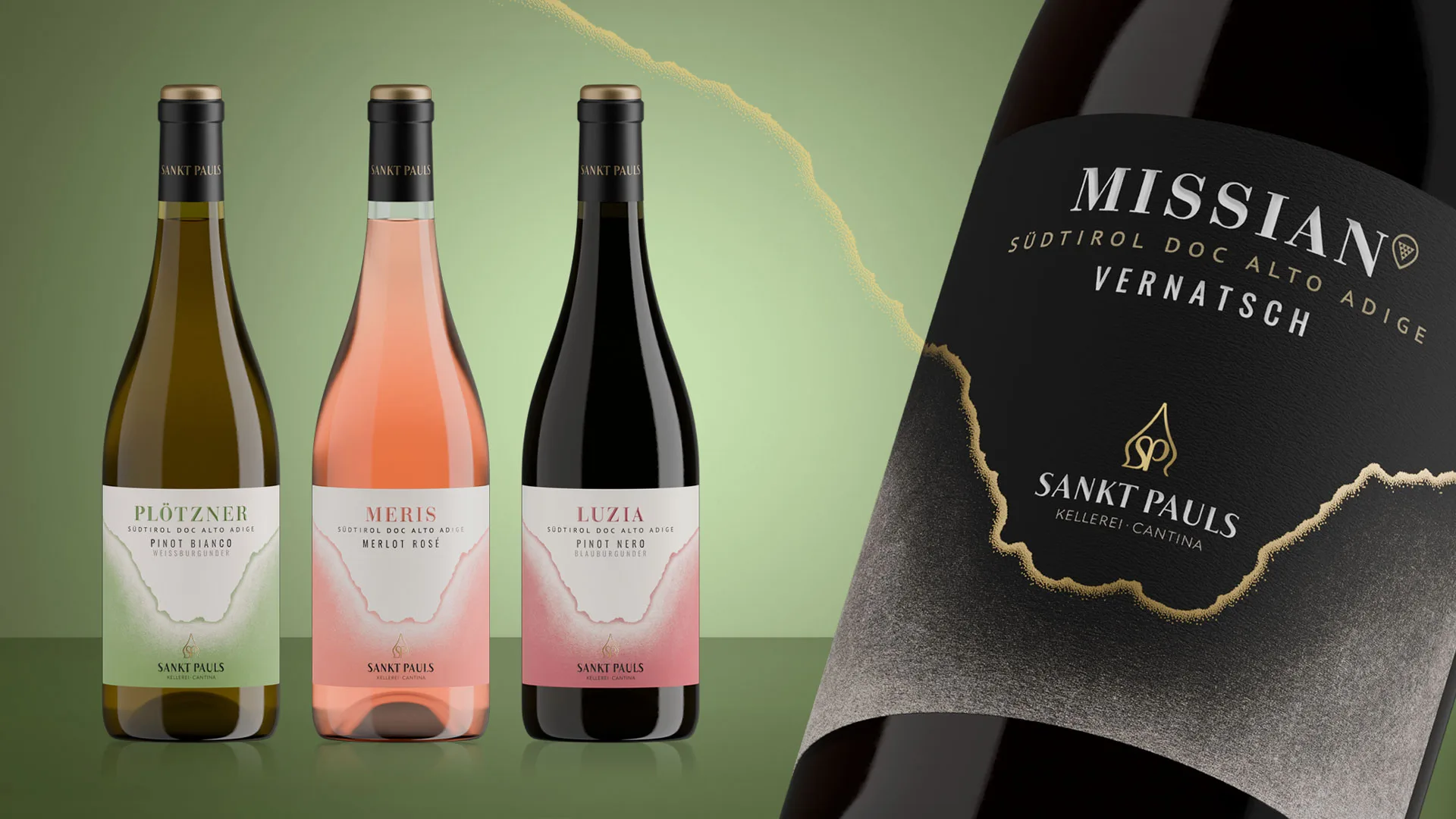
On the occasion of Vinitaly 2025, the historic Cantina Sankt Pauls presents a new brand identity and the graphic restyling of its most iconic range: the Selezione.
A project that starts from the roots of the cooperative – founded in 1907 in Appiano on the Wine Route – to enhance its founding values: the land, the centuries-old winemaking tradition and the community spirit.
An identity that evolves
An identity that evolves without losing authenticity, able to express visually the strength of the territory and to position itself consistently in the national and international market.

Strategic analysis and creativity: the contribution of NSG Design
NSG Design guided Sankt Pauls through an in-depth, multi-stage process of brand positioning analysis, definition of brand values and development of the new visual identity.
The project included
• The creation of the new logo and its iconography
• A complete restyling of the Selezione range labels
• The development of the corporate stationery
• The production of an emotional launch video
• Consulting for the alignment of communication across all brand touchpoints.
A brand that expresses territory, history and cooperative spirit
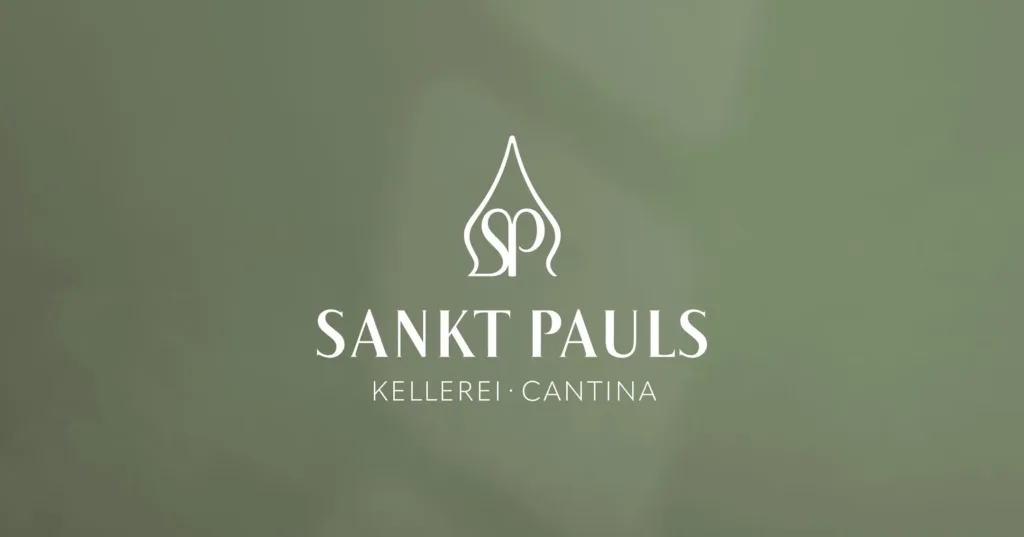
The new symbol is inspired by the spire of the bell tower of San Paolo, known as the “country cathedral”, and incorporates the historic SP monogram, taken from an old label in use until the 1980s.
A sign that visually represents the solidity of tradition and the strength of cooperation, ideally bringing together the 185 winegrower families that belong to the winery.
The full name “Sankt Pauls” also strengthens the link with the South Tyrolean territory and helps build an authentic, recognisable and distinctive brand identity.
Hand-illustrated labels inspired by Monte Macaion
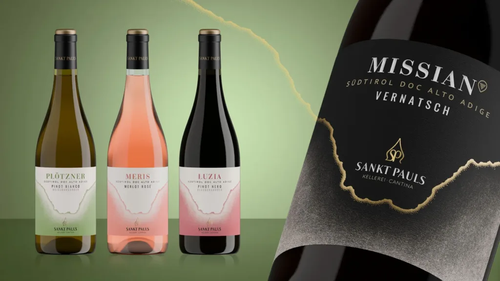
The new identity is also fully expressed in the restyling of the Selezione range labels, the productive heart of the winery.
The illustrated subject is Monte Macaion, with its distinctive Forcella Grande dominating the landscape around San Paolo.
The hand-made illustration celebrates the interplay between nature and viticulture, delivering
a recognisable image firmly rooted in the territory.
An emotional video to tell the soul of the new identity
For the official launch of the new brand identity, an emotional video was also produced, designed to convey the depth of values and the sensory dimension of the project.
The video alternates authentic glimpses of the South Tyrolean territory, details of the work in the vineyard and in the cellar, and evocative shots of the new logo and labels.
The rhythm of the images and the original soundtrack guide the viewer through an immersive story, in which you can feel the sense of belonging, the artisanal care and the balance between tradition and innovation.
It is our first collaboration with NSG, yet the harmony that developed is like that between long-standing colleagues.
They explored our history with great care and made our values their own. And so they accompanied us on this rebranding journey – fundamental for us – with great expertise, sensitivity and passion.
Tobias Leimgruber