
Corporate trade fair stand for Togni Group
- Client
- Togni Group
- Project
- 3D · Stand
- Year
- 2025
Design of the corporate trade fair stand for Togni Group
Telling, distinguishing and uniting two souls of Italian sparkling wine
Creating a stand able to represent two different brands, with distinct targets and languages, without confusing them and without one prevailing over the other, was the challenge we took on for Togni, a group from the Marche region that holds a strong position in the wine market with two major names:
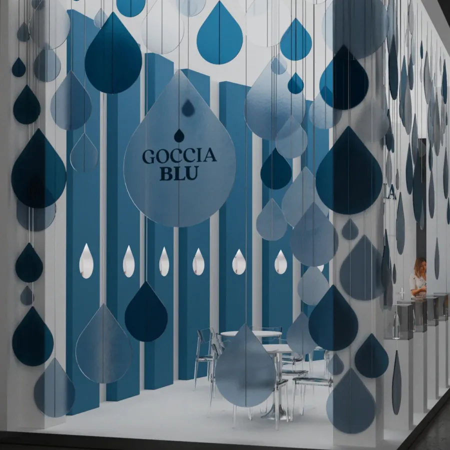
– Rocca dei Forti, a producer of sparkling wines for the large-scale retail channel
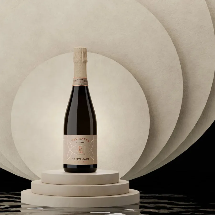
– Centinari, a line of sparkling wines dedicated to the high-end Horeca channel
The goal was ambitious: to design a corporate stand that could host both brands at two of the most important international fairs in the wine & beverage sector, Vinitaly and Prowein, enhancing their identities while avoiding any overlap or internal “visual competition”.
In an exhibition setting that is always crowded and competitive, we needed a solution that was:
– Bright and recognisable even from a distance
– Modular, so reusable and adaptable to different spaces
– Graphically neutral, yet visually strong
– Cost-optimised, without compromising quality or impact
In collaboration with NokArk and Arch&a, we developed the creative and strategic concept of the stand, expressed in a modular structure that held together aesthetics, functionality and logistical requirements. We then handled the 3D modelling and rendering of the final proposal, and the operational coordination between designers, client and suppliers.
Two identities in a single stand
Coordination, dialogue and overall vision
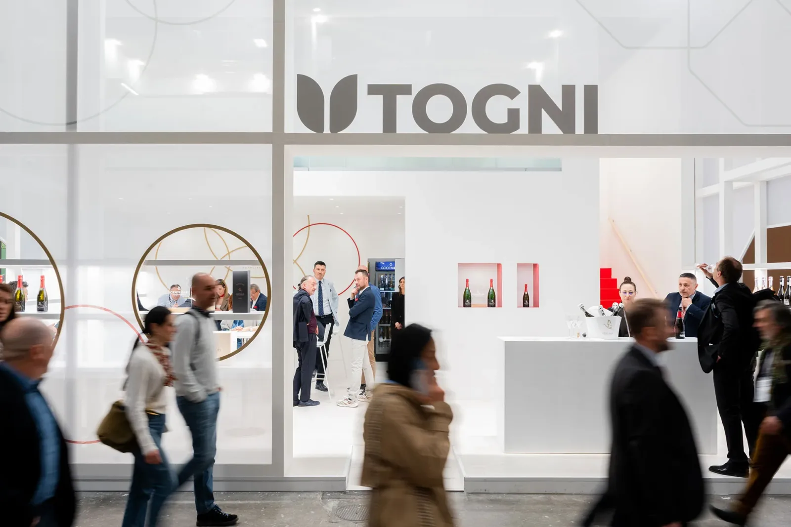
Modular concept: an architecture that leaves space for the brands
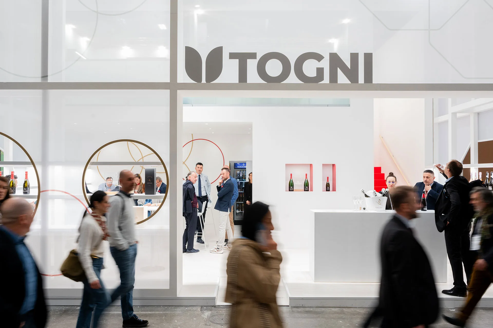
The project took shape as a single-block central structure, visually compact and uniform, but articulated inside to welcome the two souls of the group.
The two brands were developed on opposite sides of the stand, each with its own brand identity graphics, clearly recognisable but part of a single, harmonious system. No decorative excess, no oversized bottle graphics: the stylistic choice was essential and corporate, letting the physical products, displayed in dedicated niches, do the talking.
The stand was structured with:
Scaffolding
Volumes
Mezzanine
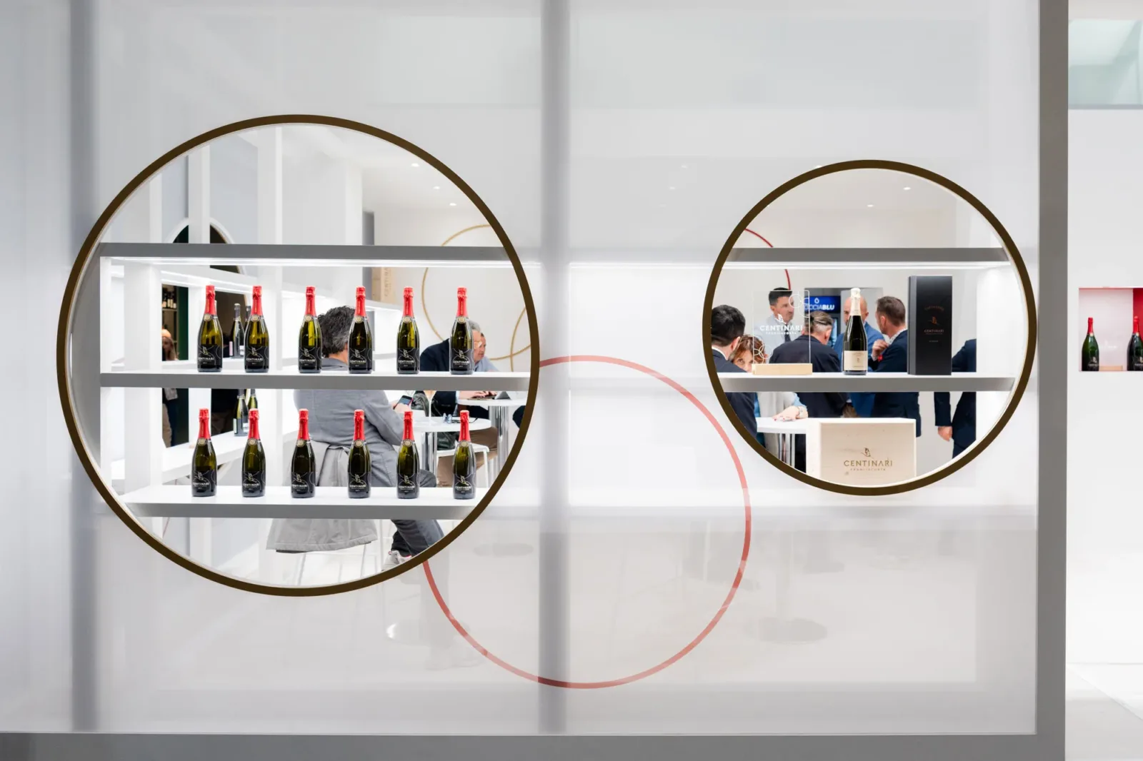
A stand that made its mark
The final result was a bright, elegant, functional and highly recognisable space, able to stand out even next to large structured stands and to give a voice to two brands with different characters and positionings.