
Turriga: the challenge of renewing an icon
- Client
- Argiolas
- Project
- Packaging · Restyling
- Year
- 2025
Packaging restyling for Argiolas’s Turriga
The challenge of renewing an icon
Turriga is the flagship wine of Argiolas and one of the most representative names in Sardinian winemaking. An award-winning product that, for over thirty years, has told the story of a strong territorial identity and a family’s vision.
When Argiolas entrusted us with the restyling of its packaging, we knew we were holding an icon, a piece of history.
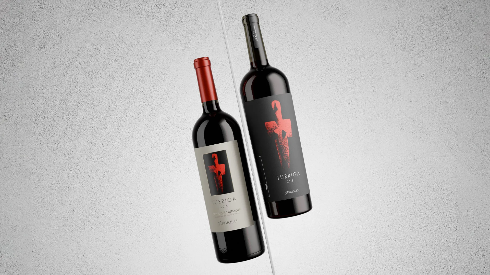
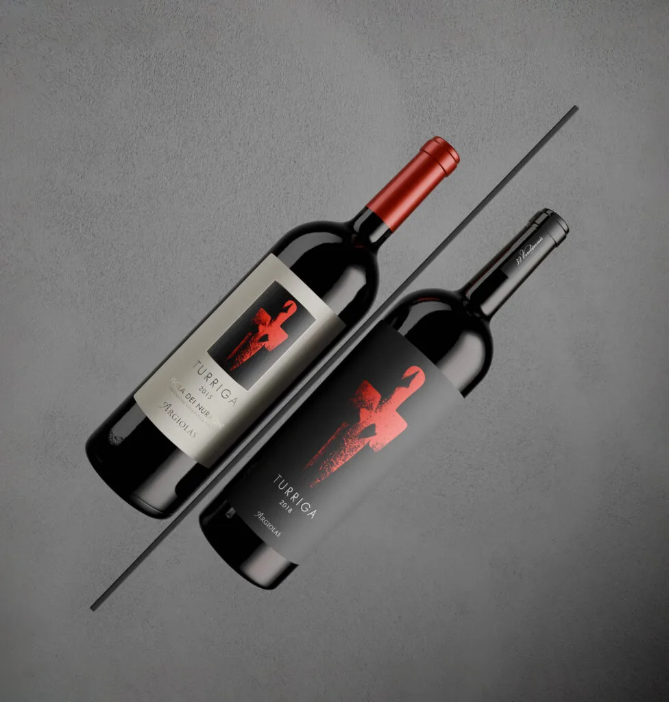
For this reason we chose to intervene with respect and delicacy. Keeping the label’s original soul intact, we moved it in a more contemporary visual direction, consistent with the stylistic evolution of the product range.
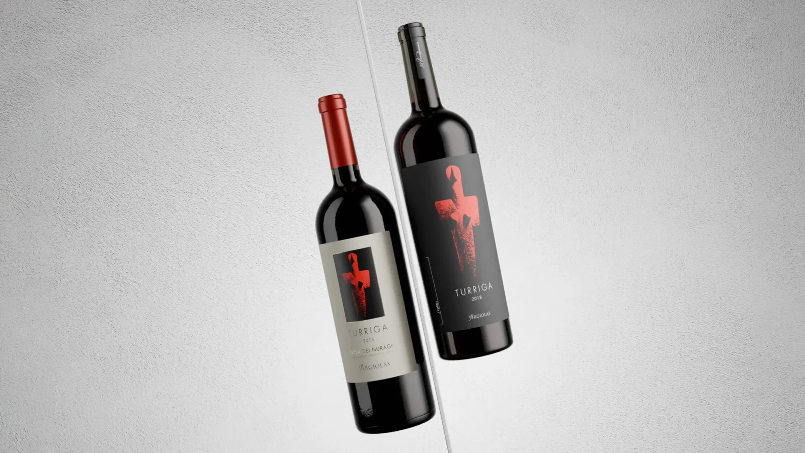
Why and how do you renew a design that works?
In the wine world, the label is much more than packaging: it is the first point of contact with the consumer, the product’s first visual story and one of the elements that most influence how it is perceived.
But when it has an established image, imprinted in the collective memory, how do you intervene without distorting it and losing the recognisability built over the years?
In this case, the change cannot be radical, but rather a careful, harmonious transformation, designed to enhance what was already there and make it even more legible, more elegant and more in tune with its premium positioning.
We worked on the details, the composition and the typography, with the aim of strengthening recognisability and renewing perception, without ever losing the link with its history.
A new graphic harmony
The name “Turriga” has its roots in a very ancient past.
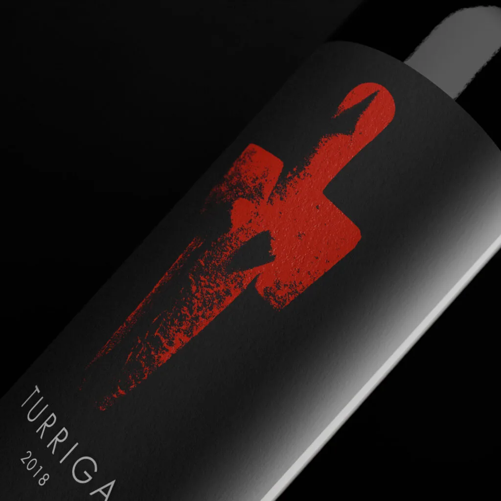
It comes from a marble statuette of the Mother Goddess, dating back more than five thousand years, found in the Turriga locality, between Senorbì and Selegas, where some of the Argiolas estates now extend.
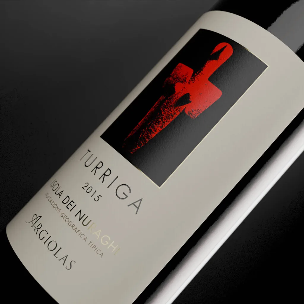
This female figure, now kept at the Archaeological Museum of Cagliari and depicted in the illustration on the label, embodies the generative force of nature, a symbol of the fertile womb of the earth, which gives life, the vine and wine.
A project born from deep analysis
Before working on the design, we carried out an in-depth strategic and marketing analysis, which allowed us to fully understand Argiolas’s positioning against its competitors and the central role this wine plays within the product range.
The Turriga label restyling is in fact part of a broader journey that also involved other wines in the range, with the aim of strengthening and renewing a coherent, distinctive visual identity for the entire brand.
Our approach: a new graphic harmony
- Graphic cleanup and layout simplification to give the essential elements room to breathe, managing space with care.
- Creation of a visual order and hierarchy that keeps the illustration at the centre, followed by the wine name. A choice that reinforces the uniqueness of this product within the range.
- Work on the illustration depicting the Mother Goddess, to bring out its chiaroscuro details and strengthen the evocative power of the original drawing.
- Use of the corporate font adopted for the other labels in the range, to create a solid family feeling, aligning the style without losing recognisability.